Portfolio
David Immanuela





Back to Home
Portaverse Design System
I led the creation of Portaverse's first design system, improving design efficiency and consistency.

CLIENT
PT Pelabuhan Indonesia

TIMELINE
December 2022

PLATFORM
Web App & Mobile App
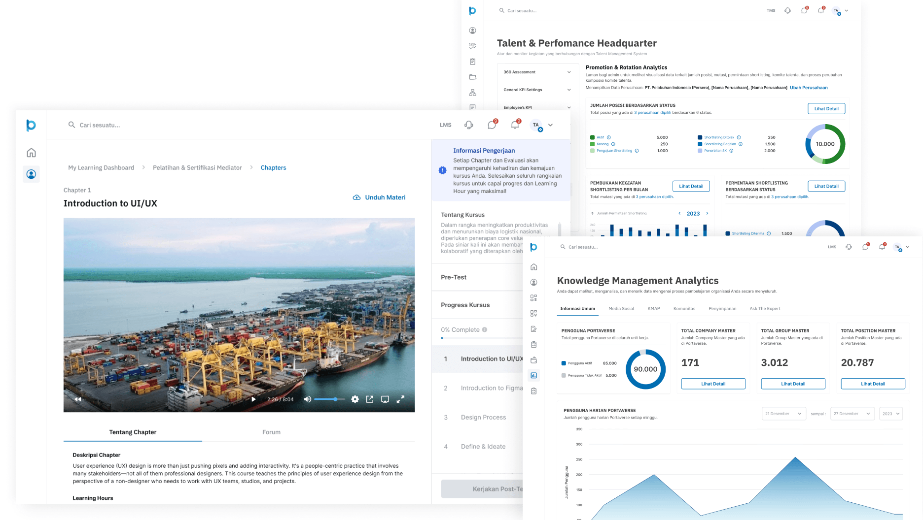
Portaverse, a comprehensive internal digital product suite for PT Pelabuhan Indonesia (Persero), consists of three primary platforms: a Knowledge Management System (KMS), a Learning Management System (LMS), and a Talent Management System (TMS). However, the absence of a cohesive design system resulted in inconsistencies across these platforms and prolonged development cycles.
In December 2022, we initiated the development of our first design system to establish a unified design language for the Portaverse. This design system has significantly improved our development efficiency, particularly for UI/UX designers and software engineers.
My product manager appointed me as the lead designer for the design system development. In collaboration with three other UI/UX designers, I worked to establish a unified visual language and ensure accessibility across all Portaverse platforms. We documented our design system and its components in Figma.
Research
Since this was our first design system, I had to rely on external resources and conduct independent research about how to develop it. I want to start adopting atomic design principles as a guiding framework. To initiate the process, I reviewed our existing Figma documents and digital assets, identifying areas of inconsistency within our product.

Current condition of our workspace
Our current workspace is disorganized, with similar components like buttons, cards, and tags scattered across different sections and archived pages.
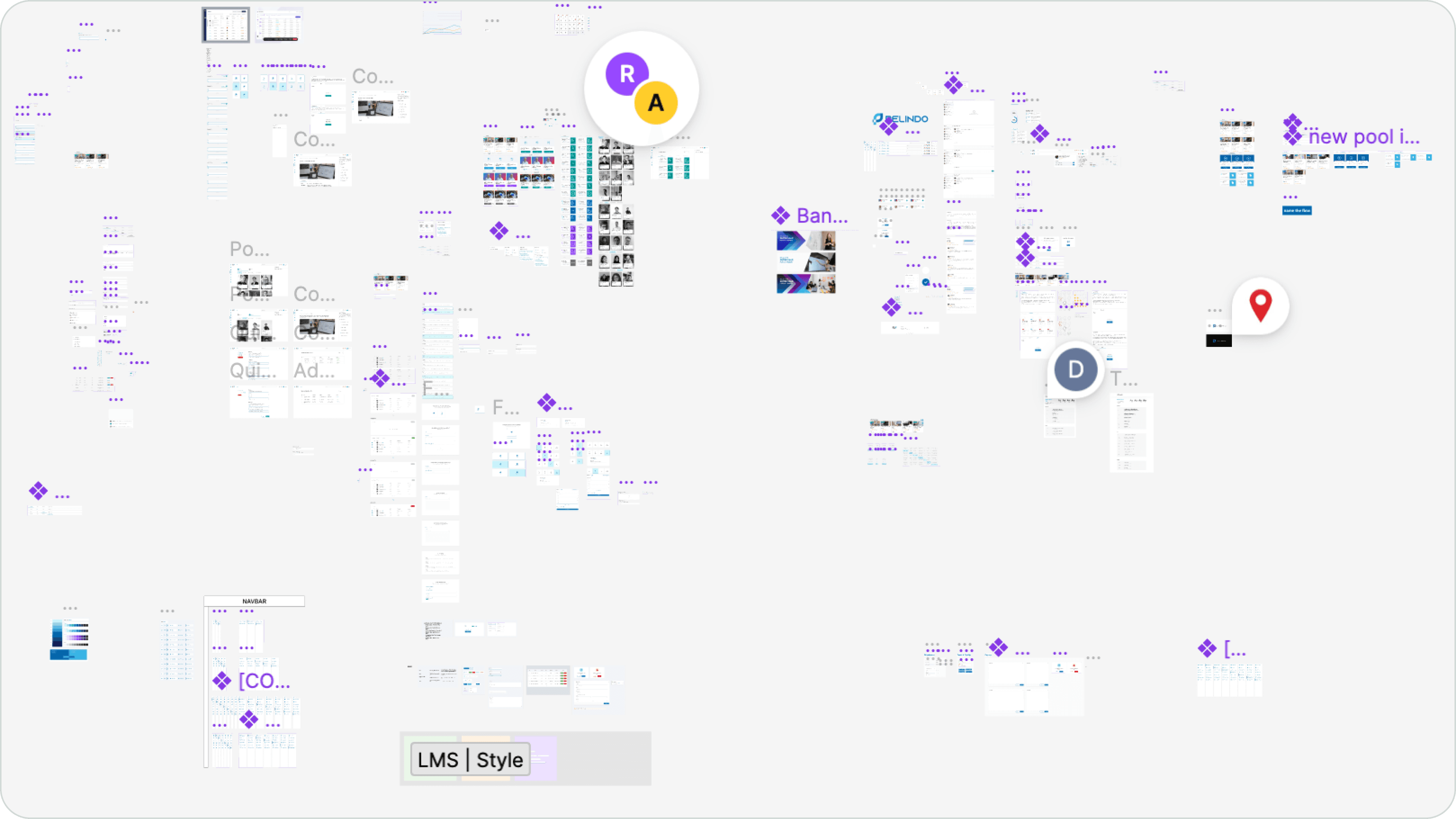
Current condition of our archive page to store components
Challenge
Portaverse's three major platforms (KMS, LMS, TMS) contain numerous pages and components. To streamline the process of identifying and curating these components, we prioritized specific component types and divided the task among team members.
We leveraged design system resources like Jabar Design System and Tutorial Design System by Halodesigner to identify 25 essential components for our design system.
Accordions
Badges
Breadcrumbs
Buttons
Cards
Checkboxes
Chips
Date inputs
File uploads
Modals
Paginations
Progress trackers
Radio buttons
Searches
Selects (drop downs)
Section messages
Snackbars
Spinners
Tables
Tabs
Teaching bubbles
Text areas
Text fields
Toggles
Tooltips
Collect and refine components
To effectively organize our curated components, I created a new page and divided it into containers (or sections in Figma). This categorization allowed us to clearly identify and differentiate between various component variations.
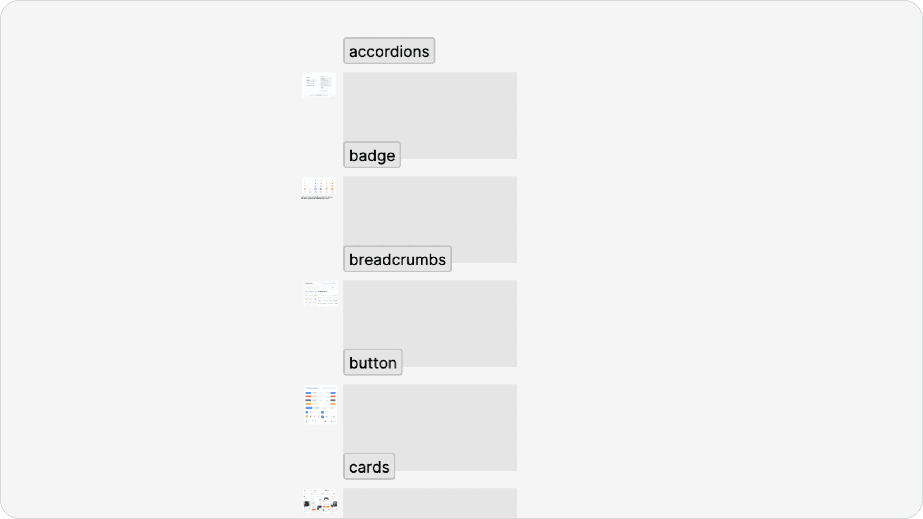
Creating sections to collect our existing component
I created a guide to help my colleagues understand component usage on the left side of the page.
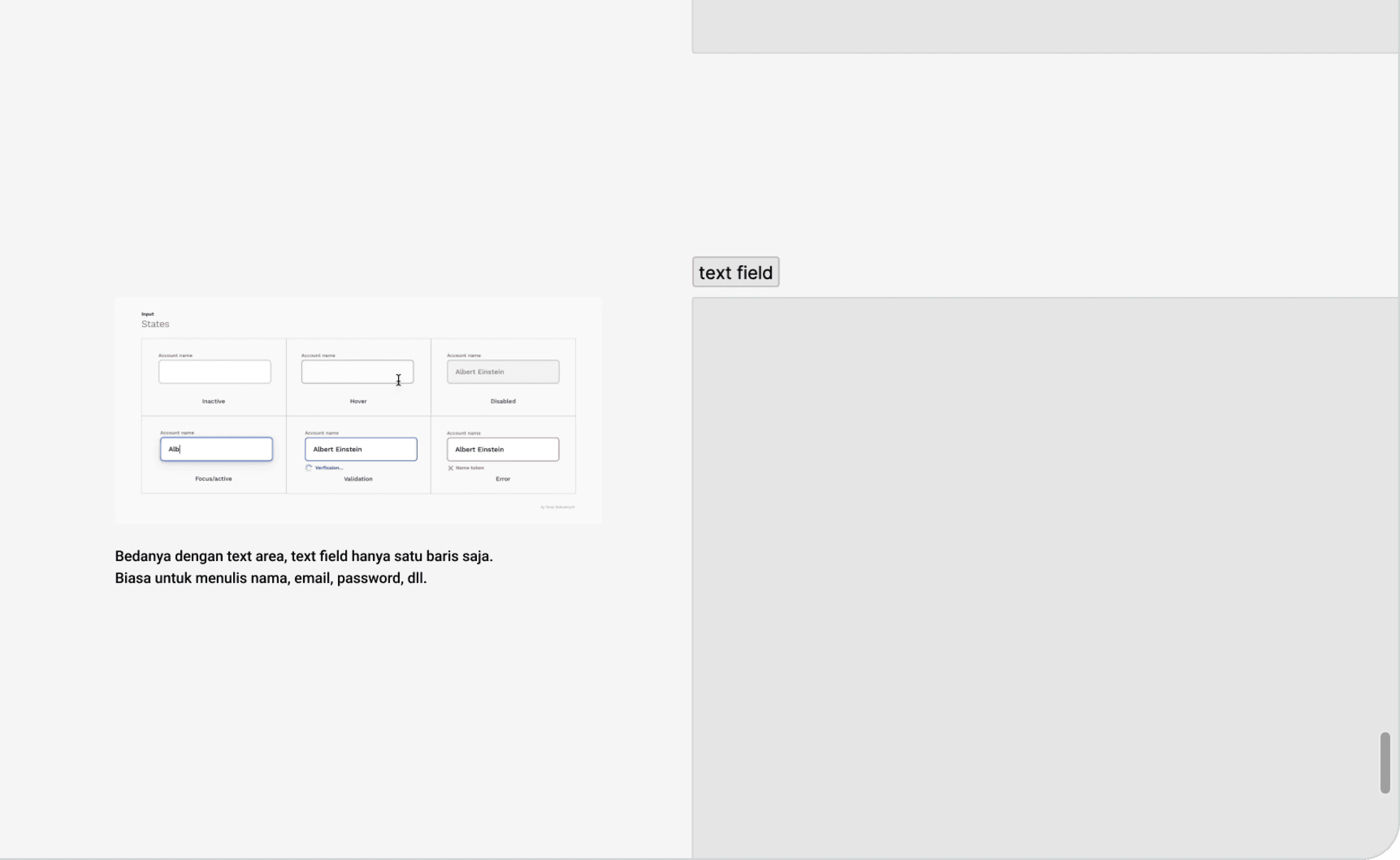
Component explanation
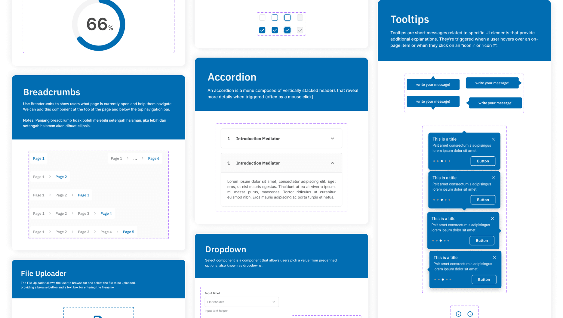
We systematically categorized our curated components from all Portaverse platforms into designated containers. This approach enabled us to clearly identify component variations and facilitate the establishment of a consistent component library across all platforms.
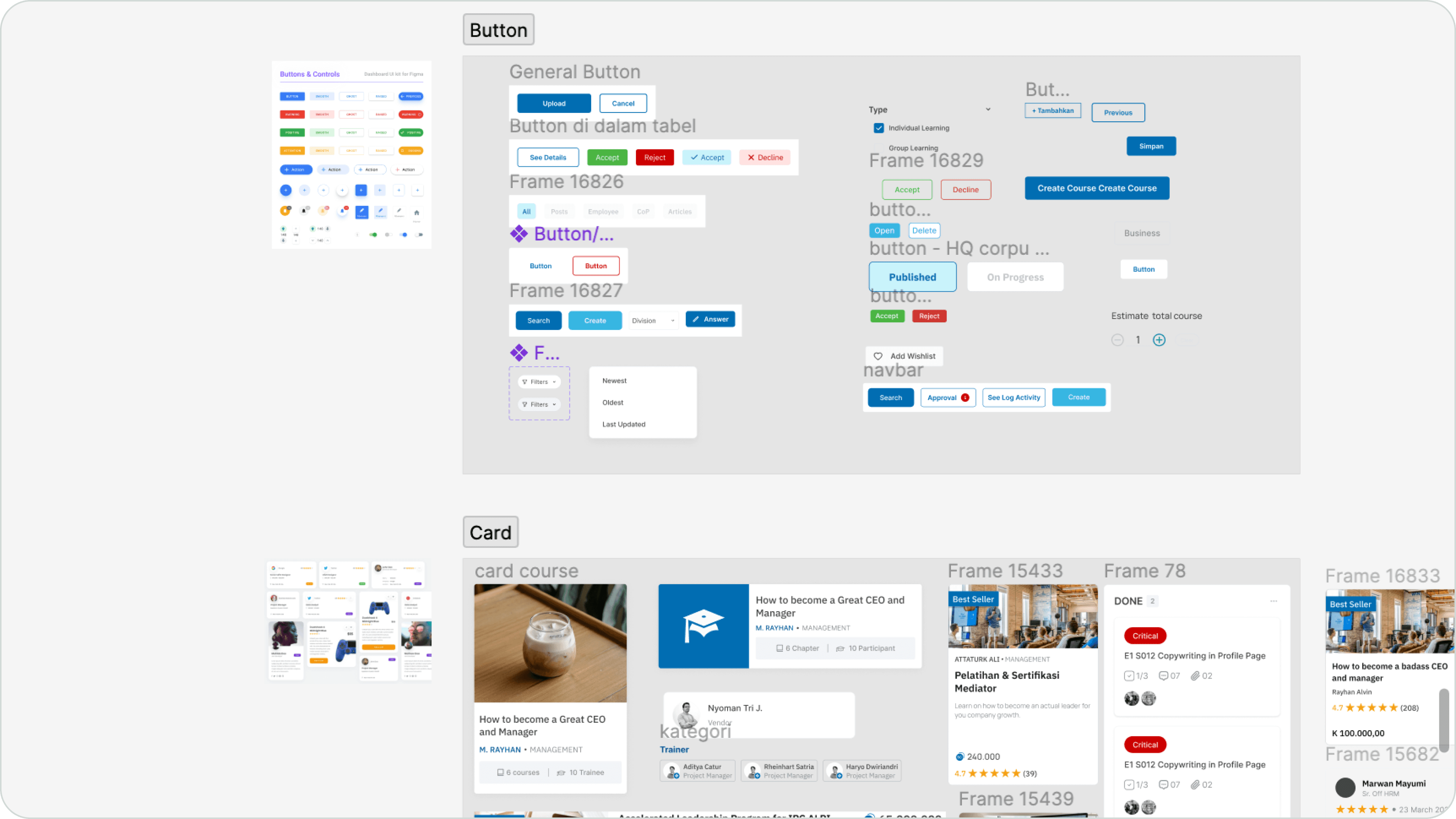
Collecting components based on the categories
Color palette
To establish a consistent color palette, we aligned with Portaverse's existing brand identity. We retained the primary blue color and the neutral colors (black, gray, and white). Additionally, we defined four accent colors: red for error, yellow for warning, green for success, and purple for information.
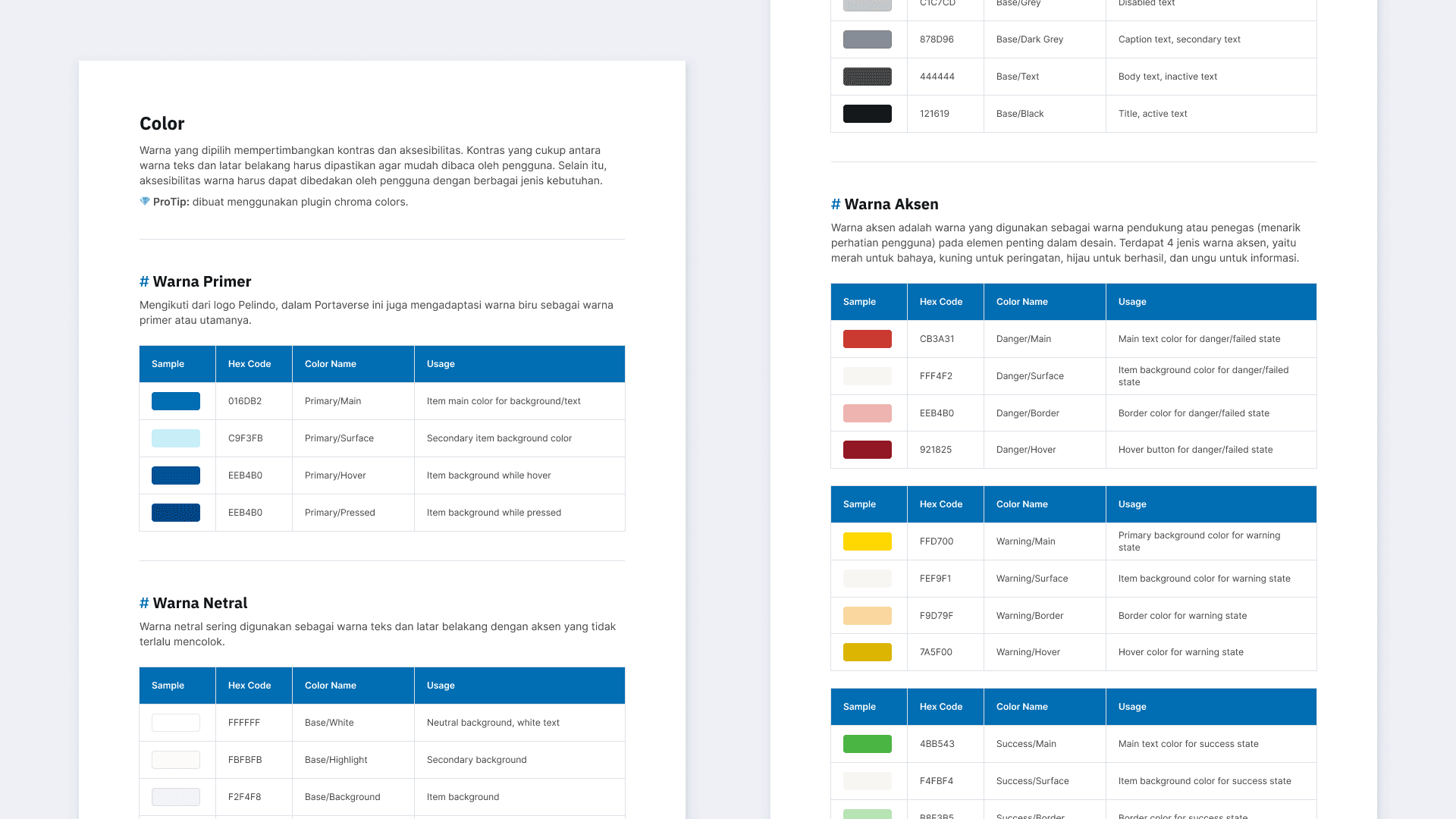
Color palette Portaverse
Size and spacing
Initially, we used a 1920px design frame, but after implementation, we discovered that the designs appeared compressed. Upon consulting with the engineering team, we learned that they were using a 1440px frame. To ensure consistency, we adjusted our design frame to match their implementation.
Additionally, I introduced a 4-point grid system to enhance component proportions and maintain consistency across all platforms.
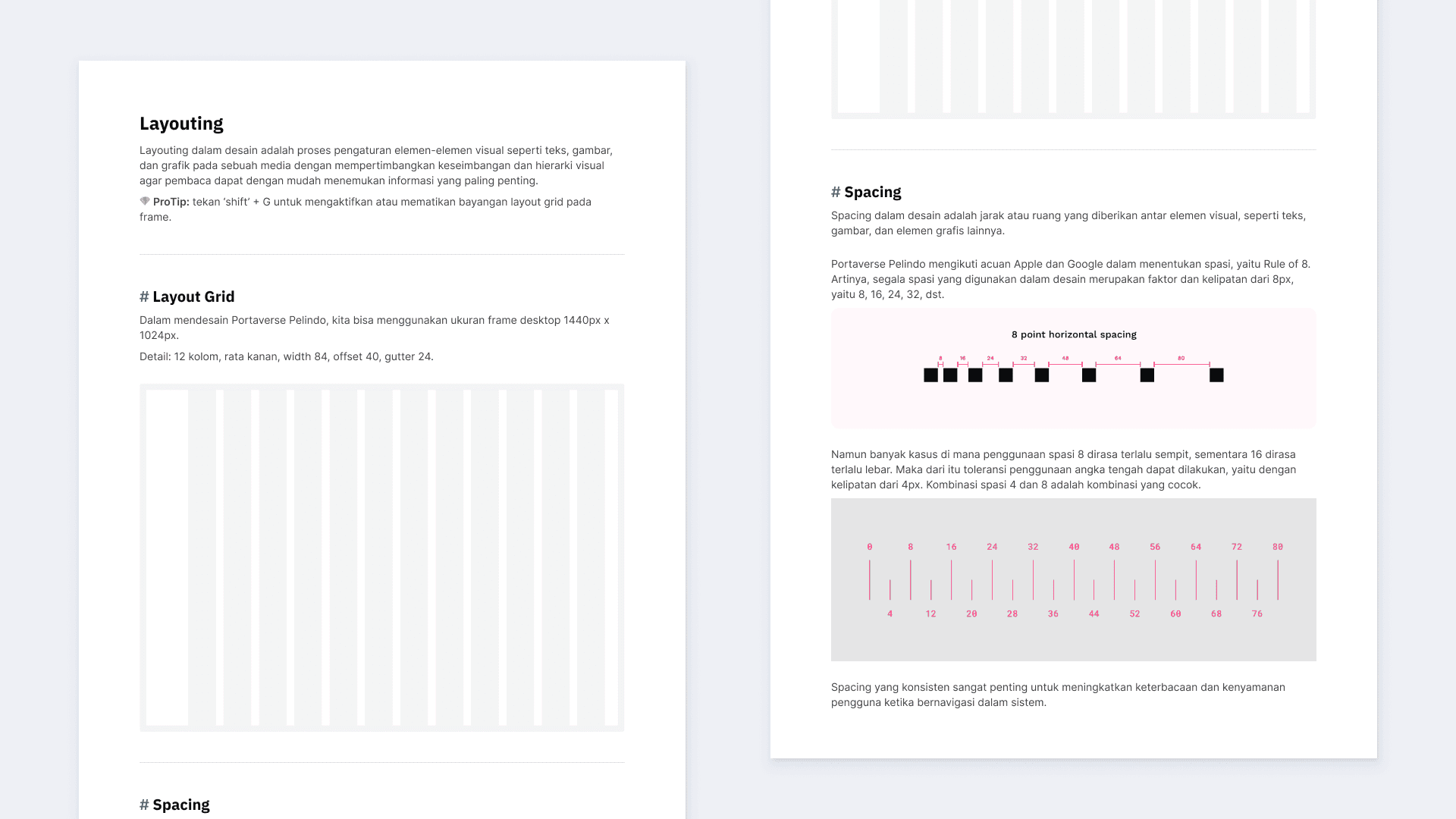
Size and spacing Portaverse
Typography
After analyzing the current font usage in Portaverse, we found three primary fonts: Inter, IBM Plex Sans, and Manrope. To enhance visual consistency and contrast, we decided to limit our font choices to two.
Considering that Inter is already widely used for body text, we opted to retain it. To create a distinct contrast with the body text, we selected IBM Plex Sans as the heading font, given its prevalence in existing titles.
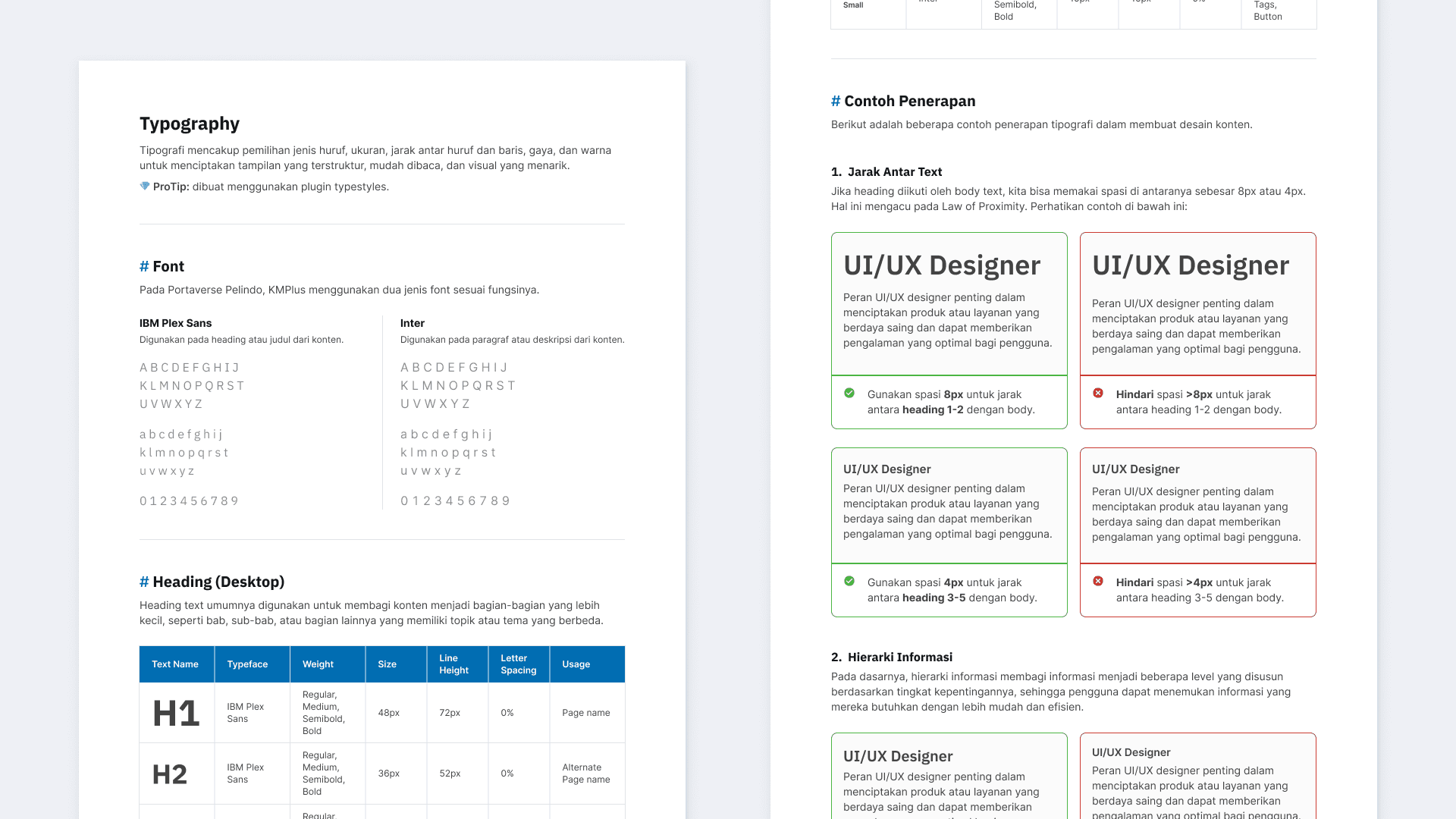
Typography Portaverse
Components
Using our curated components, we defined standard designs for all Portaverse platforms. Several components were particularly noteworthy.
Buttons
We discovered various button variants, including text-only, leading icon, and trailing icon. To simplify the design system, Heri, one of my colleagues, recommended we adopt a boolean approach, creating a complete button variant and using toggles to show or hide icons.
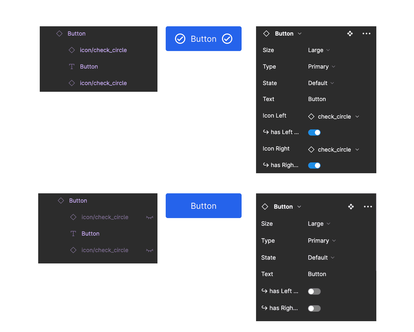
Button boolean example, from figma community
Modals (Pop-Up)
The diverse nature of content within our modals presented a challenge in standardizing their design. Initially, we explored the use of slot cards as a potential solution, but this approach quickly became unwieldy as the number of required content components grew.
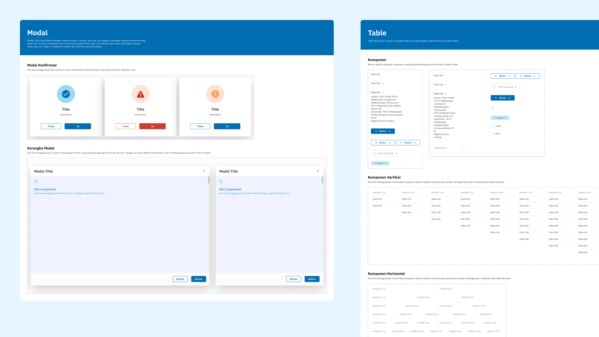
Instead, we decided to standardize the modal's frame and size, while allowing for flexible content customization. This approach provides a more adaptable solution for our various content needs.
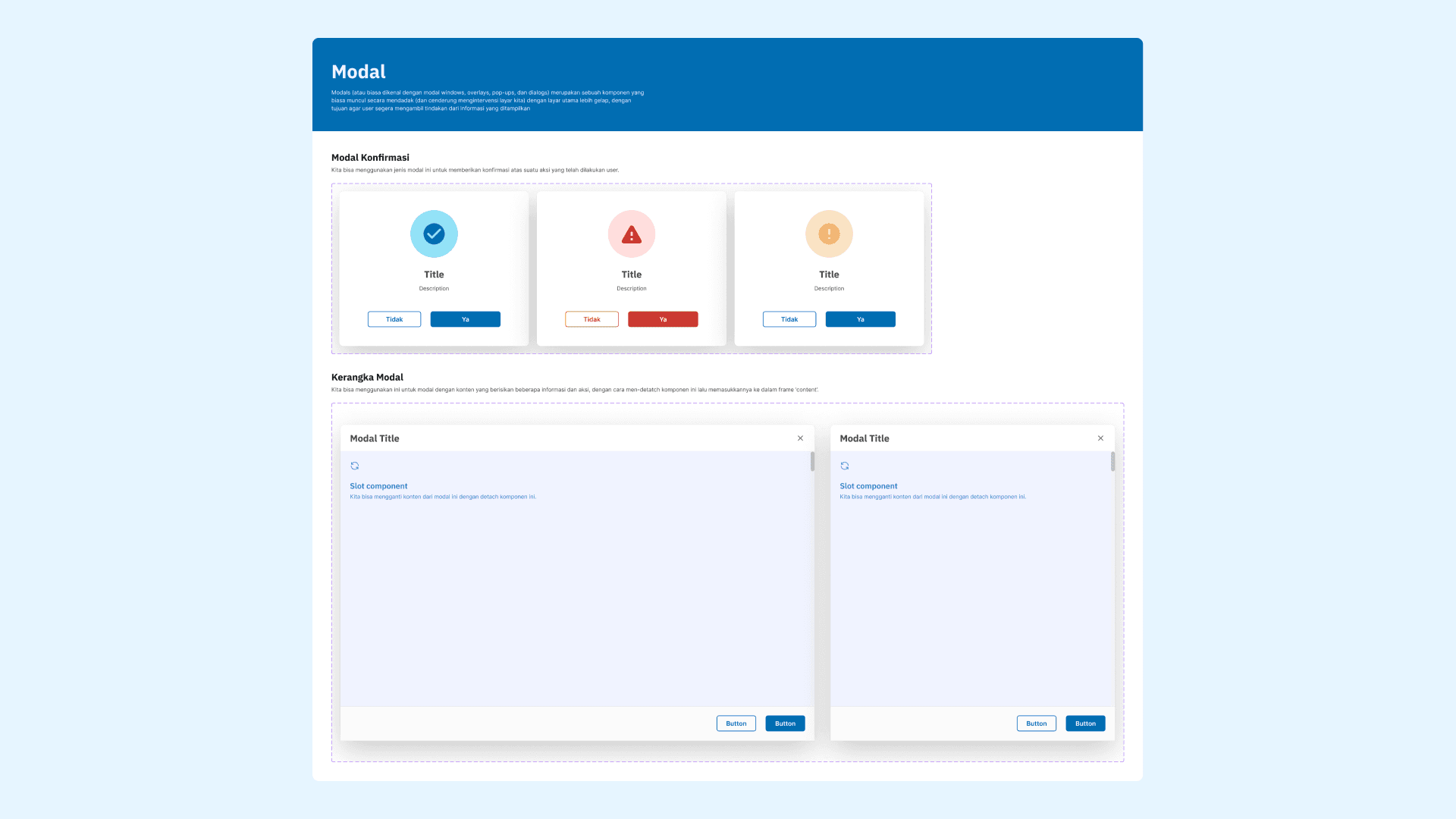
Modal components
Table
We observed that our tables exhibited varying font sizes, likely due to diverse content and column counts. To establish consistency, we created a variety of cell variants, including text-only cells, badge cells, and button cells. These variants can be combined and arranged within rows and columns to create a wide range of table configurations.
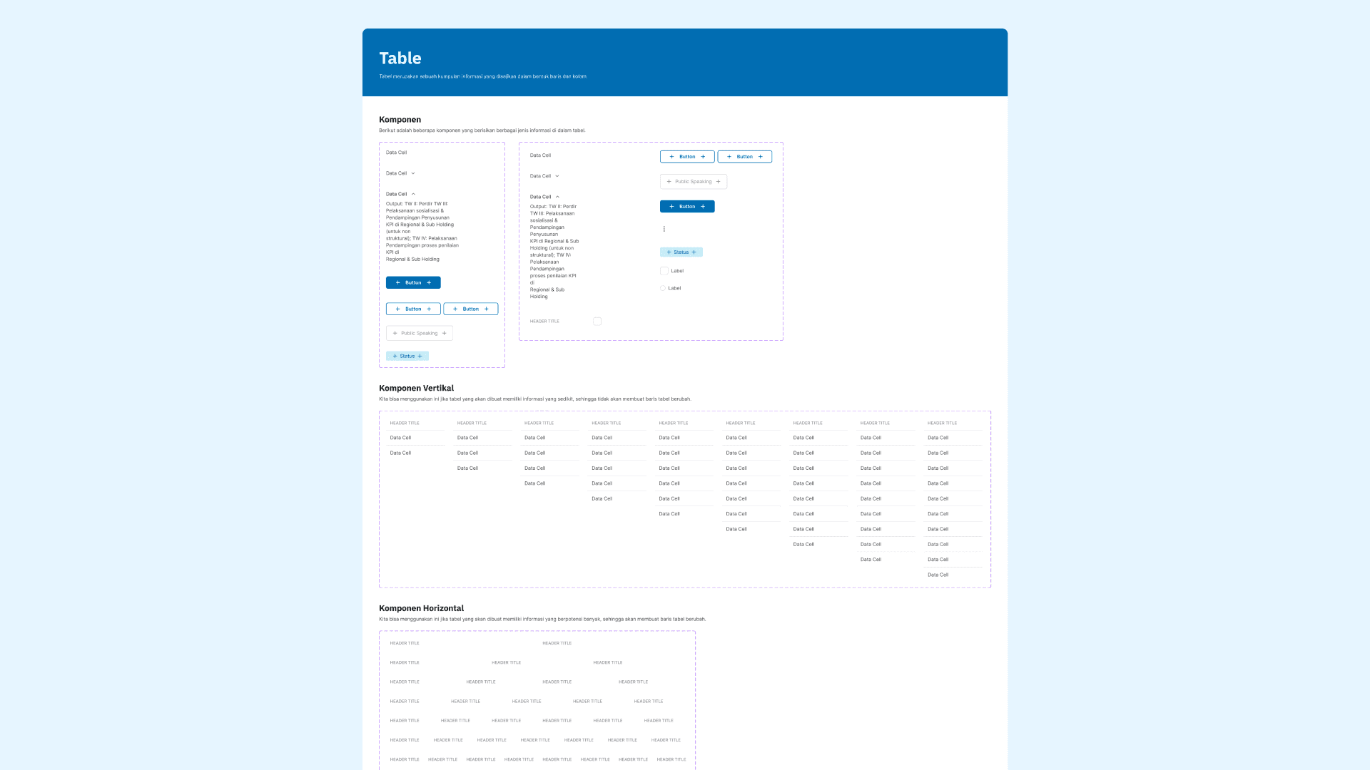
Table components
Documenting the design system
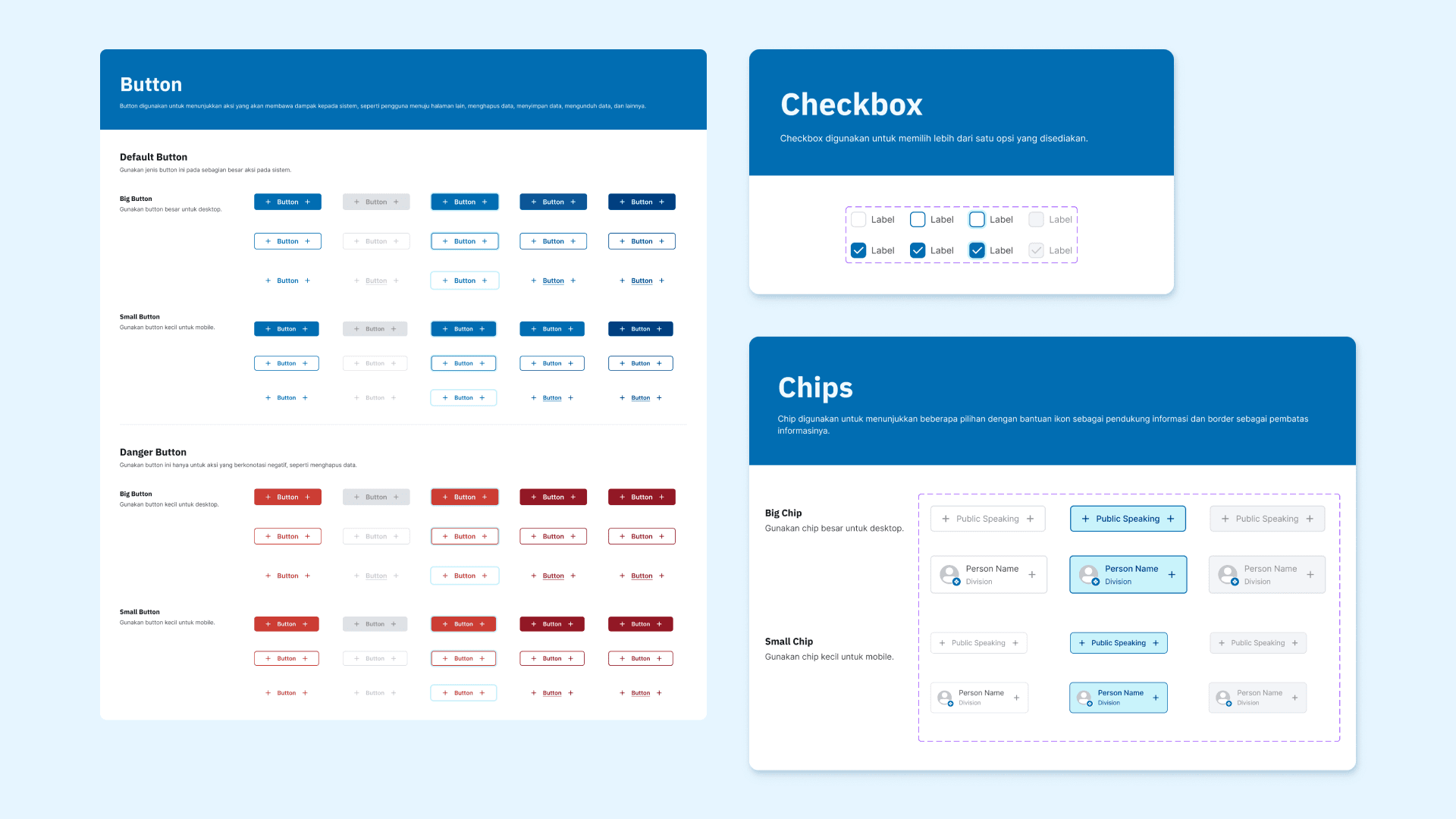
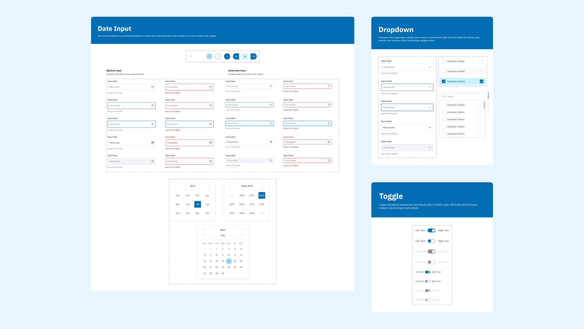
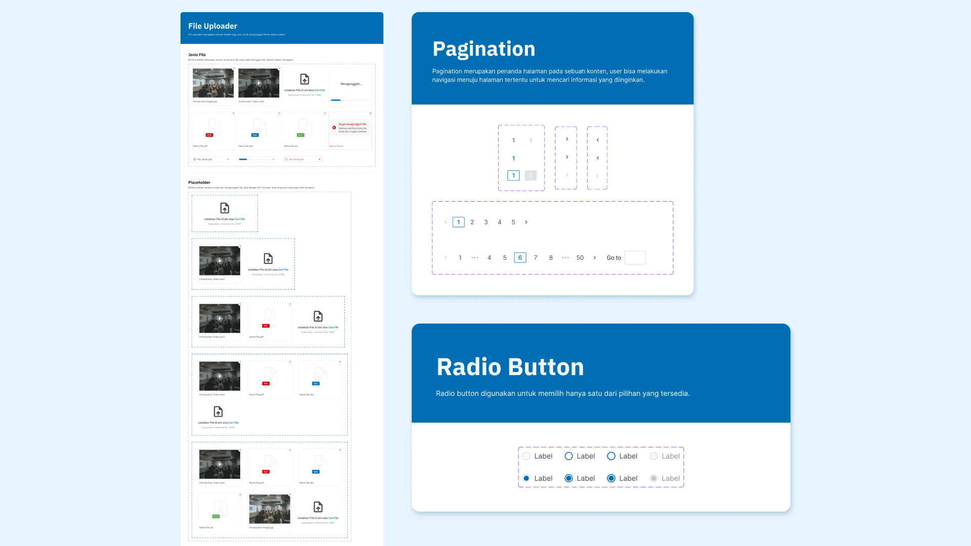
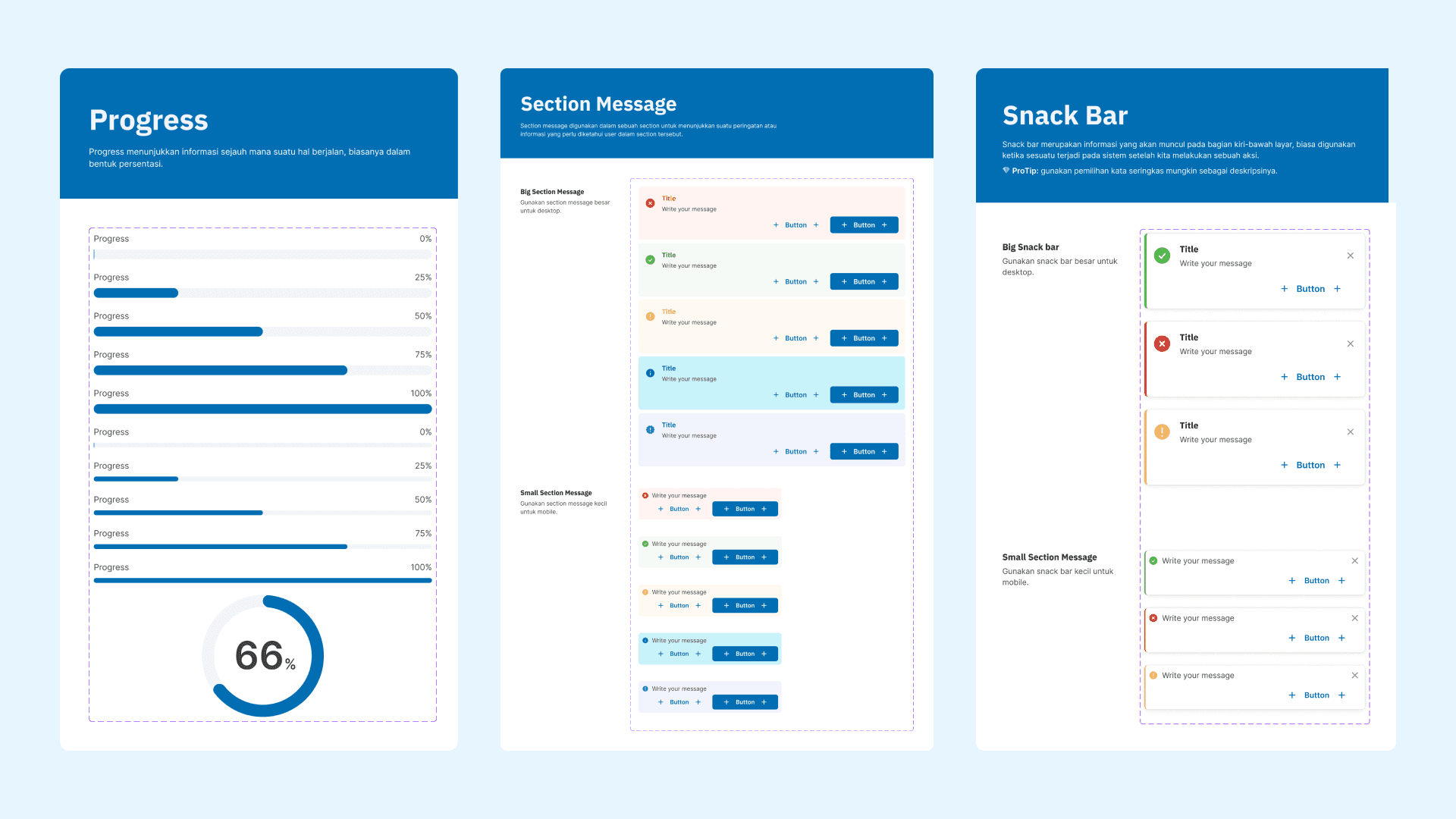
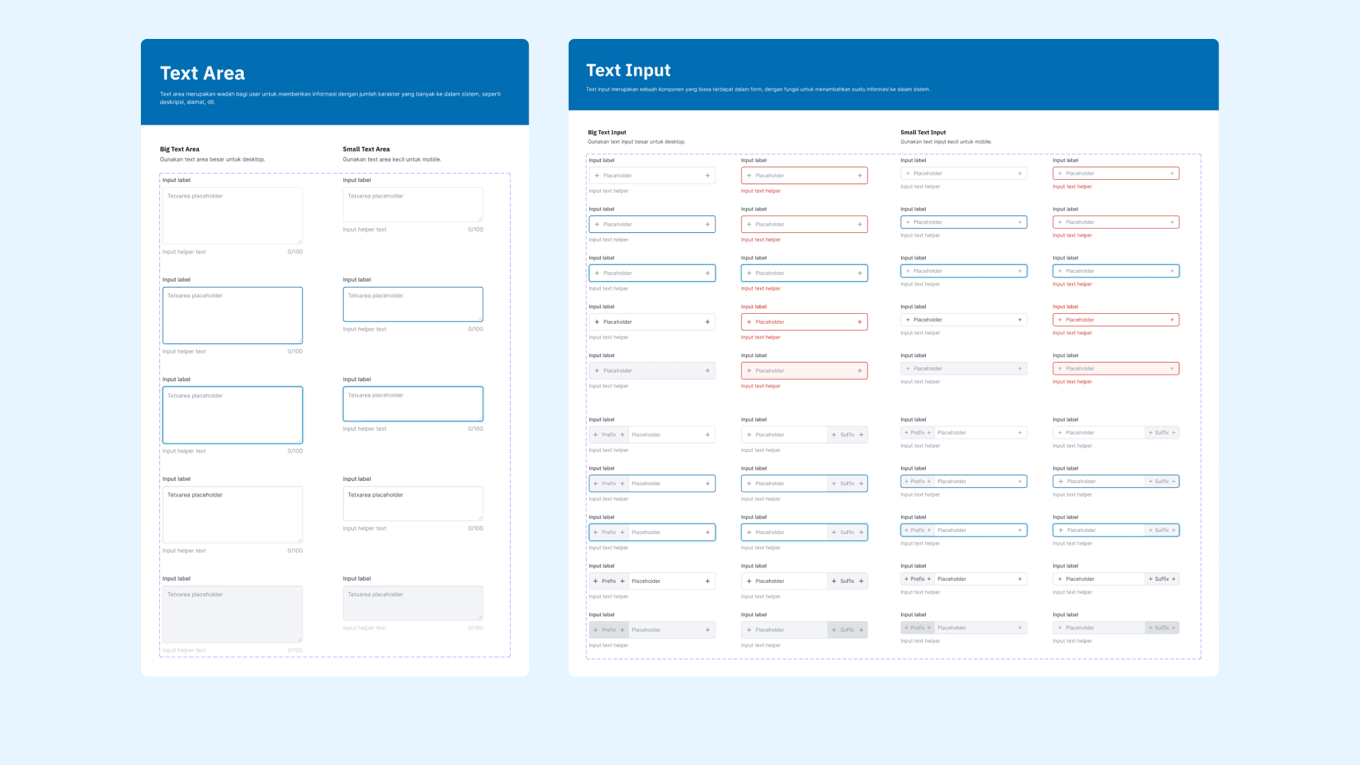
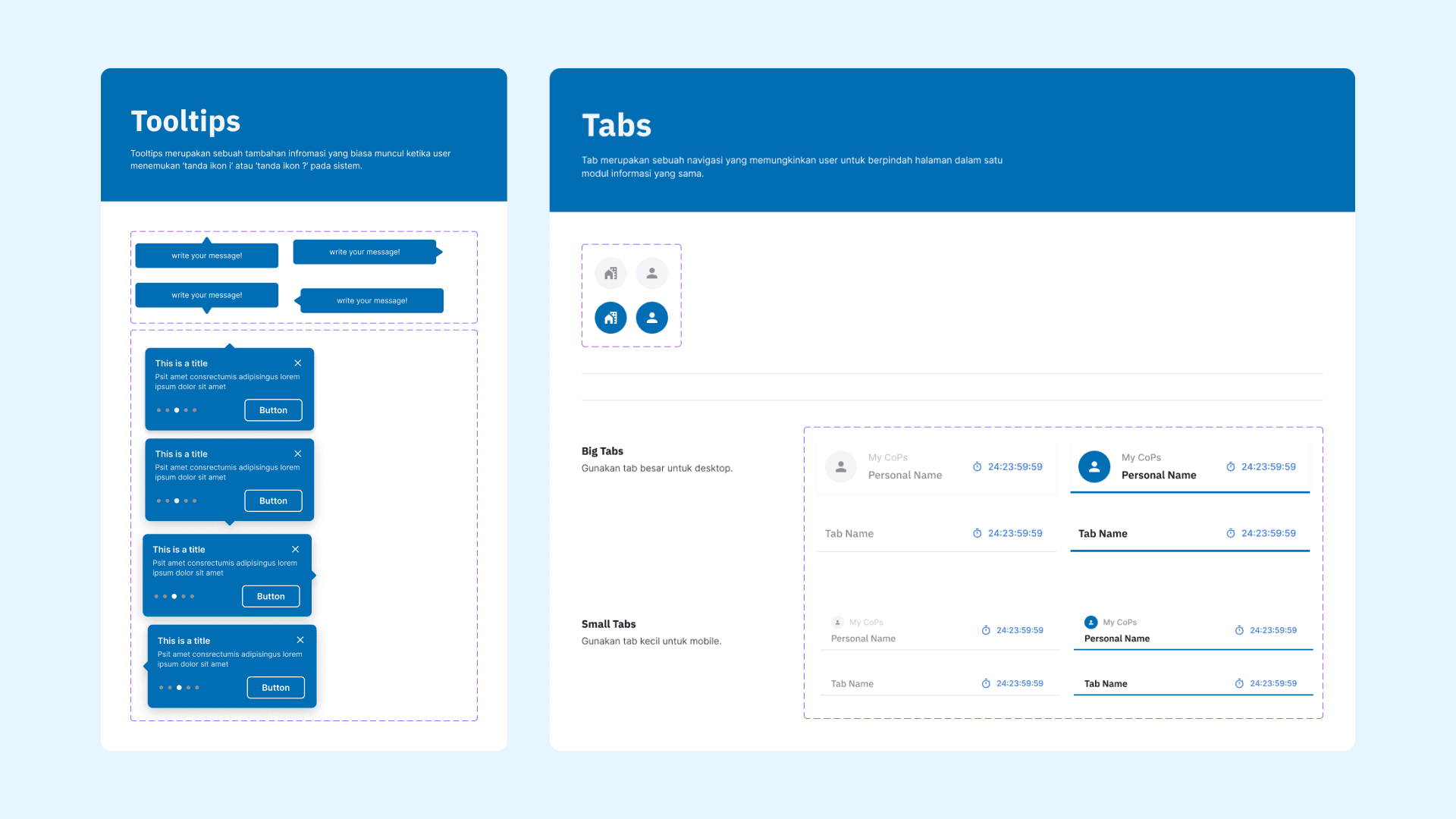
After finalizing the design system components, we developed documentation to ensure their consistent and effective usage. This documentation is essential for product managers, engineers, and new team members to understand the Portaverse system and its design principles.
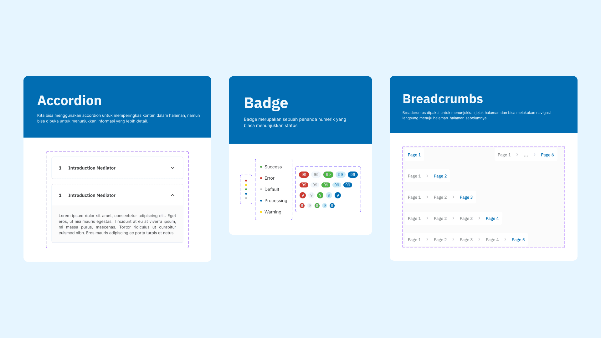
Benefits to our team
Optimize workflow
By utilizing pre-built components, both UI/UX designers and software engineers can significantly accelerate the product development process. Designers can quickly access and implement components directly from our design system, using the shift+i shortcut in Figma, while engineers can efficiently integrate these components into their codebase.
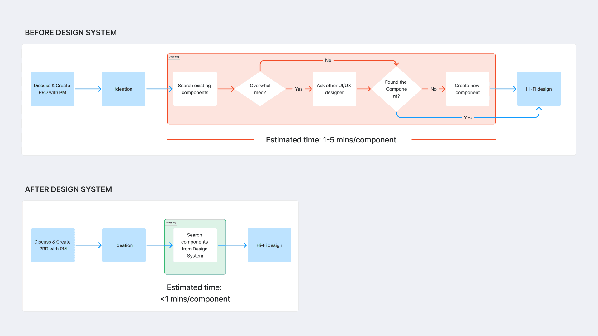
Before vs after design system for UI/UX design team
Preserve product uniformity
The design system ensures consistency in the usability and visual appearance of components across all Portaverse platforms. This standardization enhances the user experience by minimizing the time required to learn and adapt to different interfaces, as users encounter familiar functionalities and visual elements across various platforms.
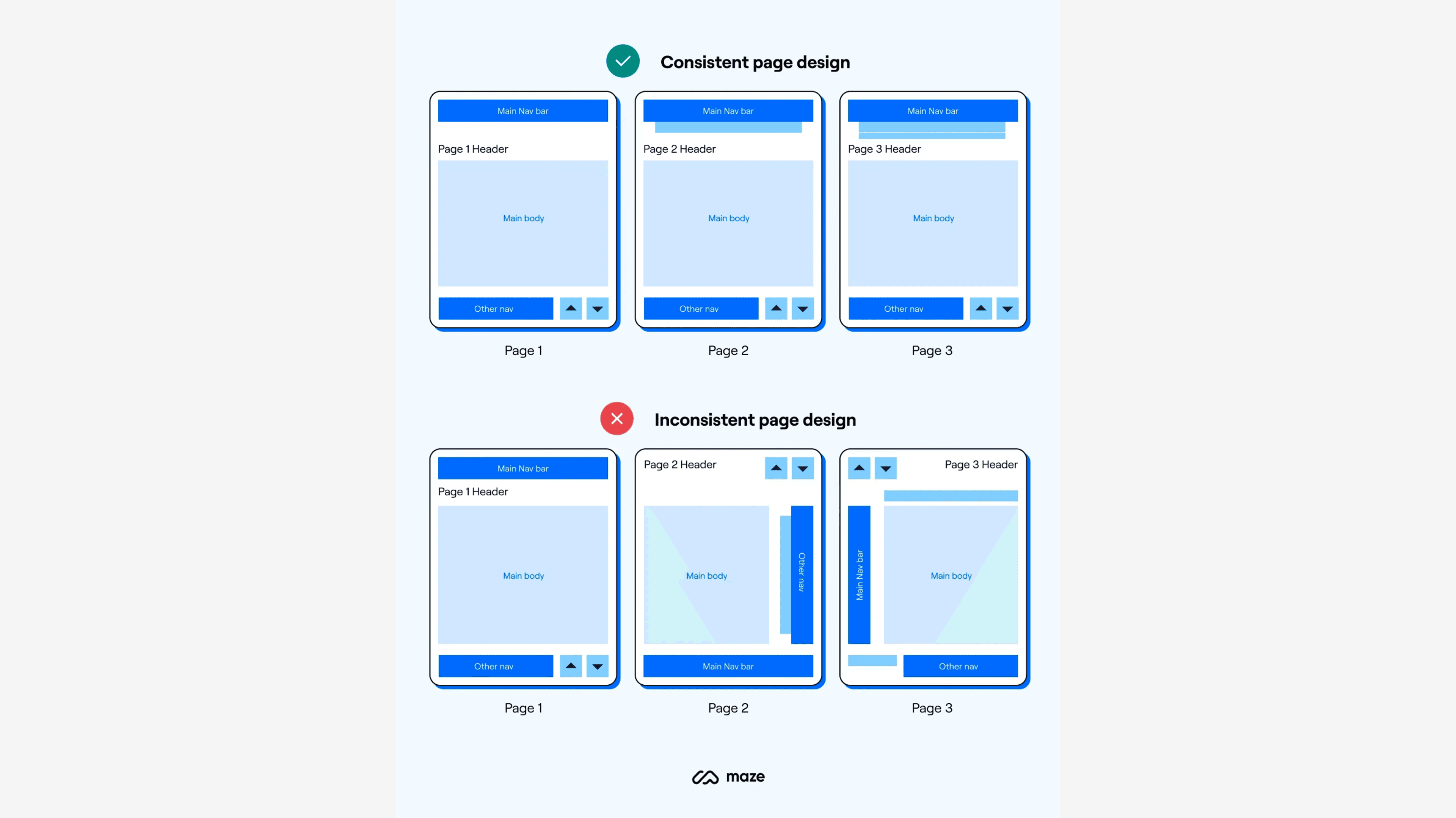
Consistent design, from "The 6 Key Principles of UI Design" by Chappal
Reflection
I am delighted to have completed this task of leading the creation of Portaverse's first design system. I would like to express my sincere gratitude to my colleagues for their cooperation and support throughout the process.
Despite the inevitable imperfections of this initial design system, I have gained invaluable knowledge and experience from this opportunity.
Collaborating and leading remotely presented unique challenges as the only remote team member. I had to actively participate in team meetings, ensuring clear communication and effective instruction delivery.
As I had no existing guidelines, I learned to conduct independent research to identify and implement appropriate solutions for our specific needs.
I learned the importance of documentation in capturing both the process and the outcome of a project. By documenting my work, I can learn from past mistakes and use the documentation as a reference point in the future.
© 2024 by David Immanuela