Portfolio
David Immanuela





Back to Home
Improving Consultation Interface for Better Interaction
Halodoc Improvement
The redesigned doctor consultation service improves user experience by simplifying doctor search and consultation.
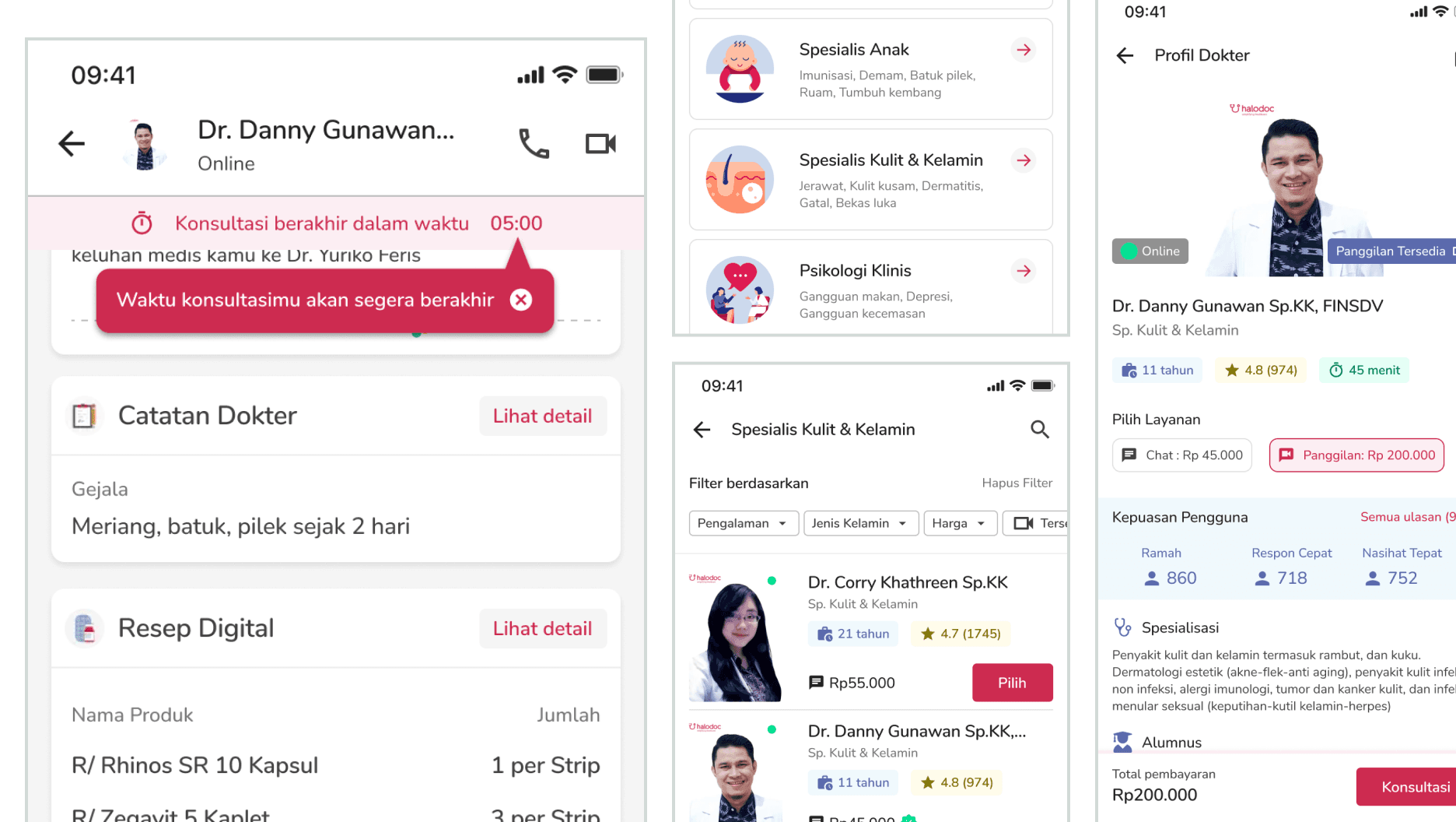

CASE STUDY
Purwadhika featuring Halodoc Mentor

TIMELINE

PLATFORM
Mobile App
As a new Halodoc user, I explored the app and website to understand its features and services. I was guided by my mentor from Purwadhika, Faris Rakha, and my practitioner from Halodoc, Steve Lokajaya, throughout the project.
Project goal
Improve the precision and fluidity of user interaction with the app,
Create a more intuitive and user-friendly interface.
My role
UX Researcher, conducted online surveys, usability tests, and interviews to gather user requirements and preferences.
UX Designer, utilized these insights to define user flows and design concepts.
UI Designer, transformed these concepts into detailed, high-fidelity screen designs.
Understanding Halodoc the company
As an archipelago nation with a population exceeding 200 million, Indonesia faces a significant healthcare disparity, with a relatively low doctor-patient ratio of 4.27 doctors per 10,000 population.
To address this challenge, Halodoc, a user-friendly telemedicine platform, strives to expand access to healthcare services across the country. With over 20 million users and a network of 20,000 doctors, Halodoc aims to connect patients with medical professionals. To ensure optimal service delivery, Halodoc conducts regular training sessions to equip doctors with the necessary skills to utilize the platform effectively and respond to patient inquiries virtually.
Despite these efforts, the question persists: Does Halodoc successfully meet the expectations of its users?
Source: Bisnis.com (April 2022)
My data and user research results
To gain insights into Halodoc's user experience, I initiated a survey by sharing it with my relatives via personal chats and Instagram Stories. The survey, hosted on Google Forms, aimed to gather quantitative data and identify potential participants for in-depth interviews.
Some of the questions I asked in this online survey were:
What service are you looking for from a healthcare app?
What are the factors that give you the confidence to consult with a doctor?
How was your experience using the Halodoc app?
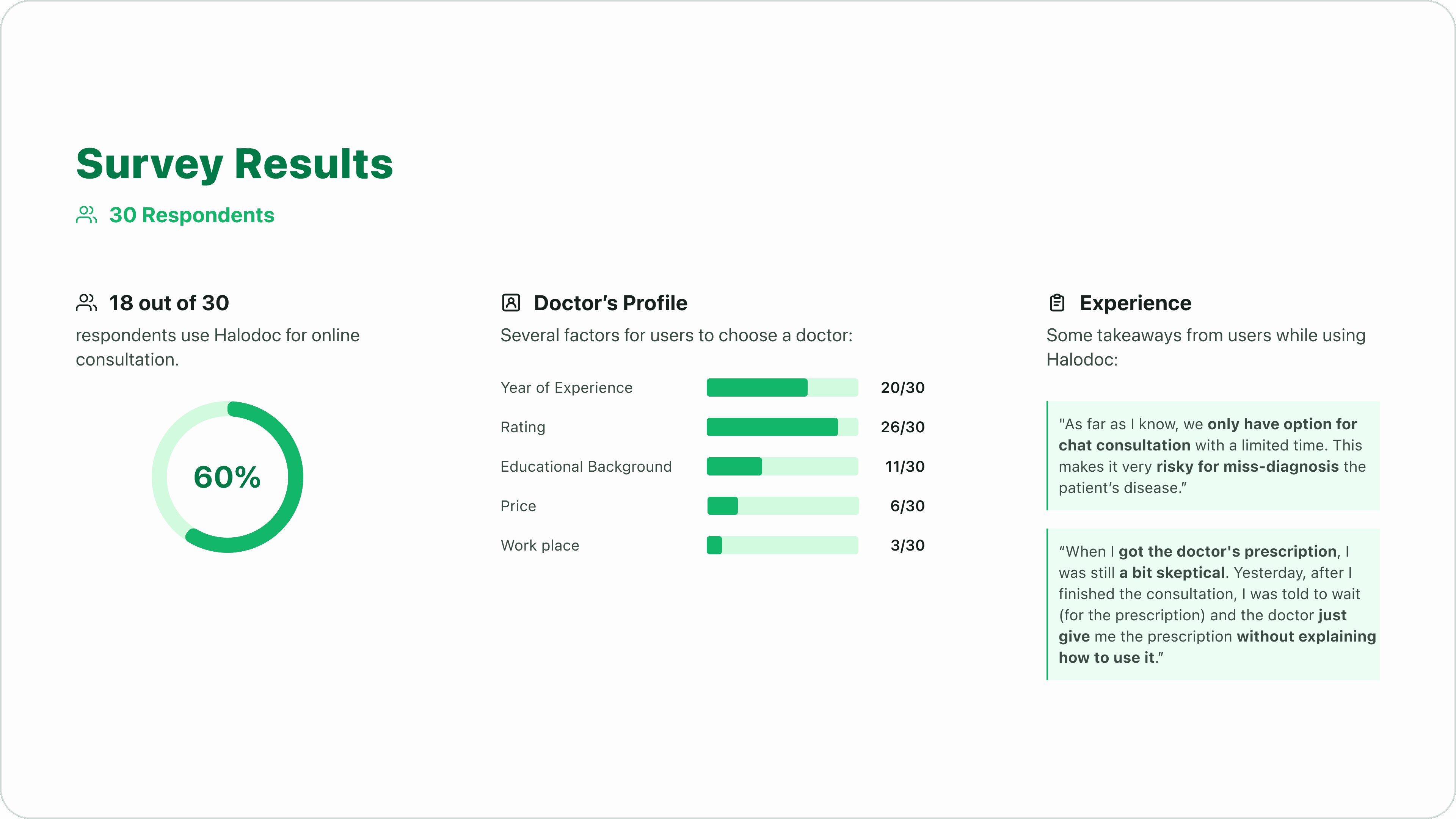
Survey Results
Based on the survey results, I identified the consultation process as an area for improvement. I will conduct usability testing and in-depth interviews with five survey respondents to gather more insights.
Usability testing
I created four scenarios for five participants to complete, observing their user journeys using Maze for remote usability testing.
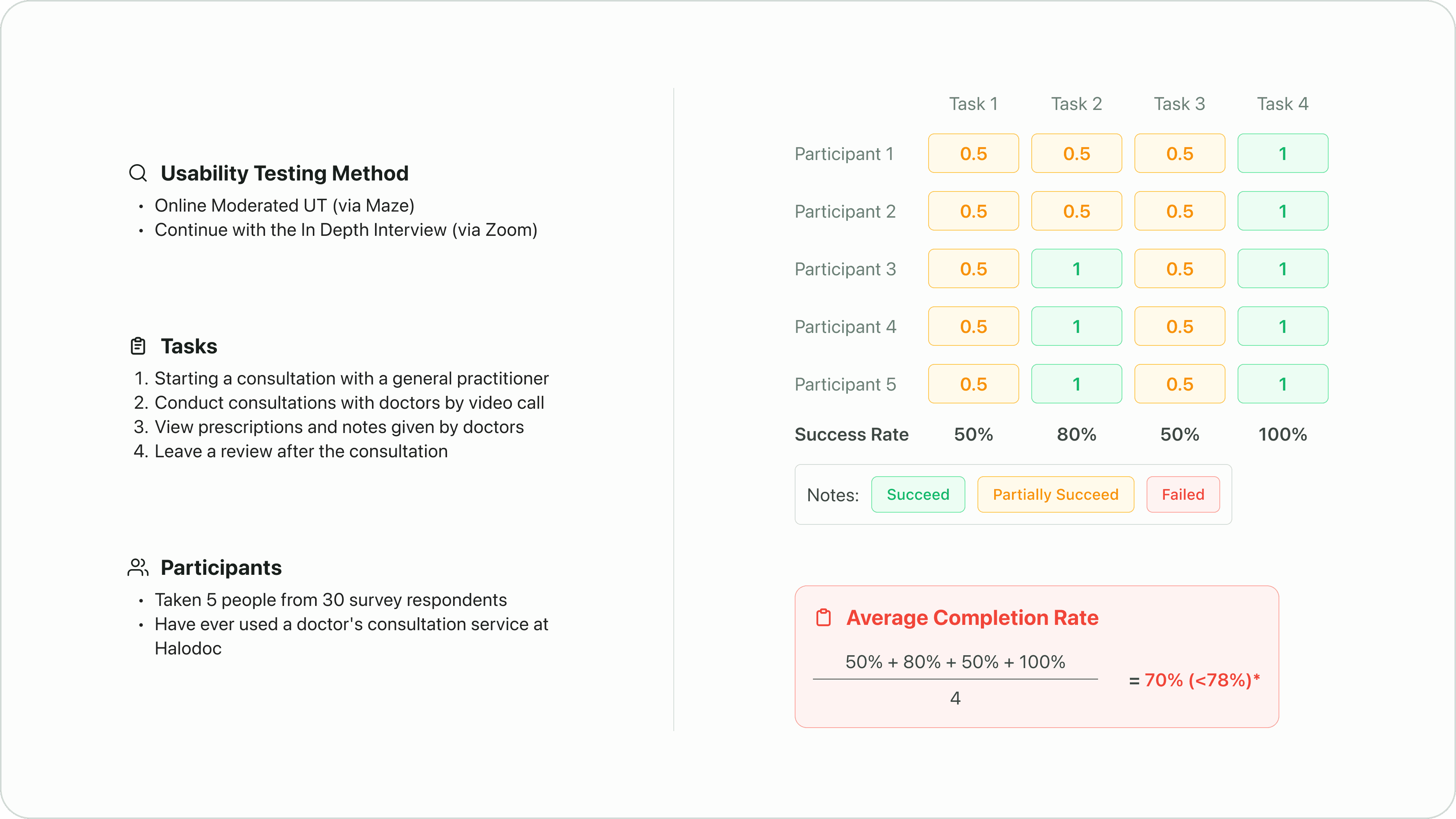
Usability Testing Results
*Usability Metrics of Effectiveness: According to a study carried out by Jeff Sauro, the average Task Completion Rate is 78% (based on an analysis of 1,100 tasks). Source
In-depth interview
I followed up the usability testing with in-depth interviews to explore users' experiences with Halodoc in more detail.
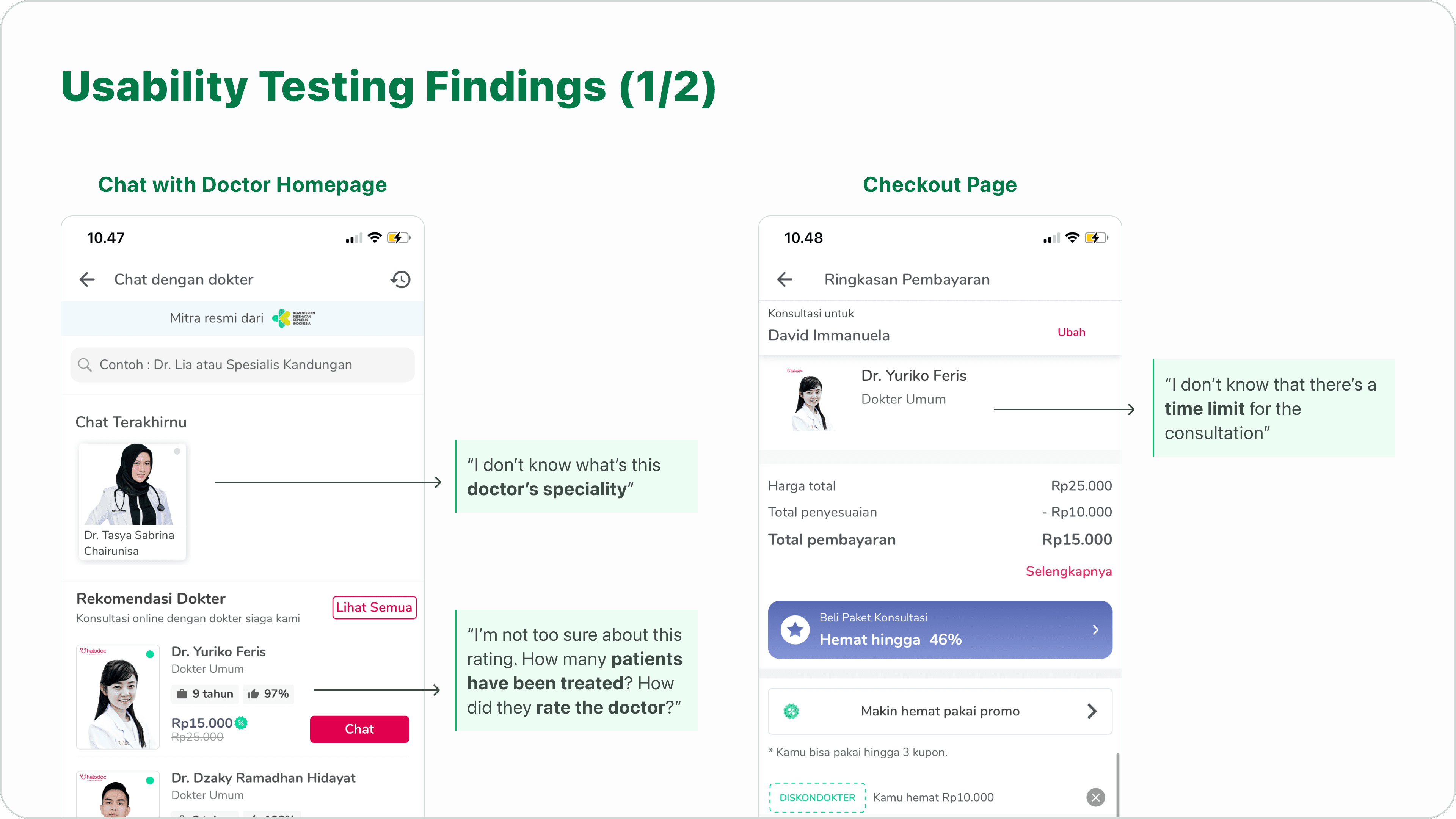
UT 1 Findings on the Home "Chat with Doctor” Homepage and Checkout Page
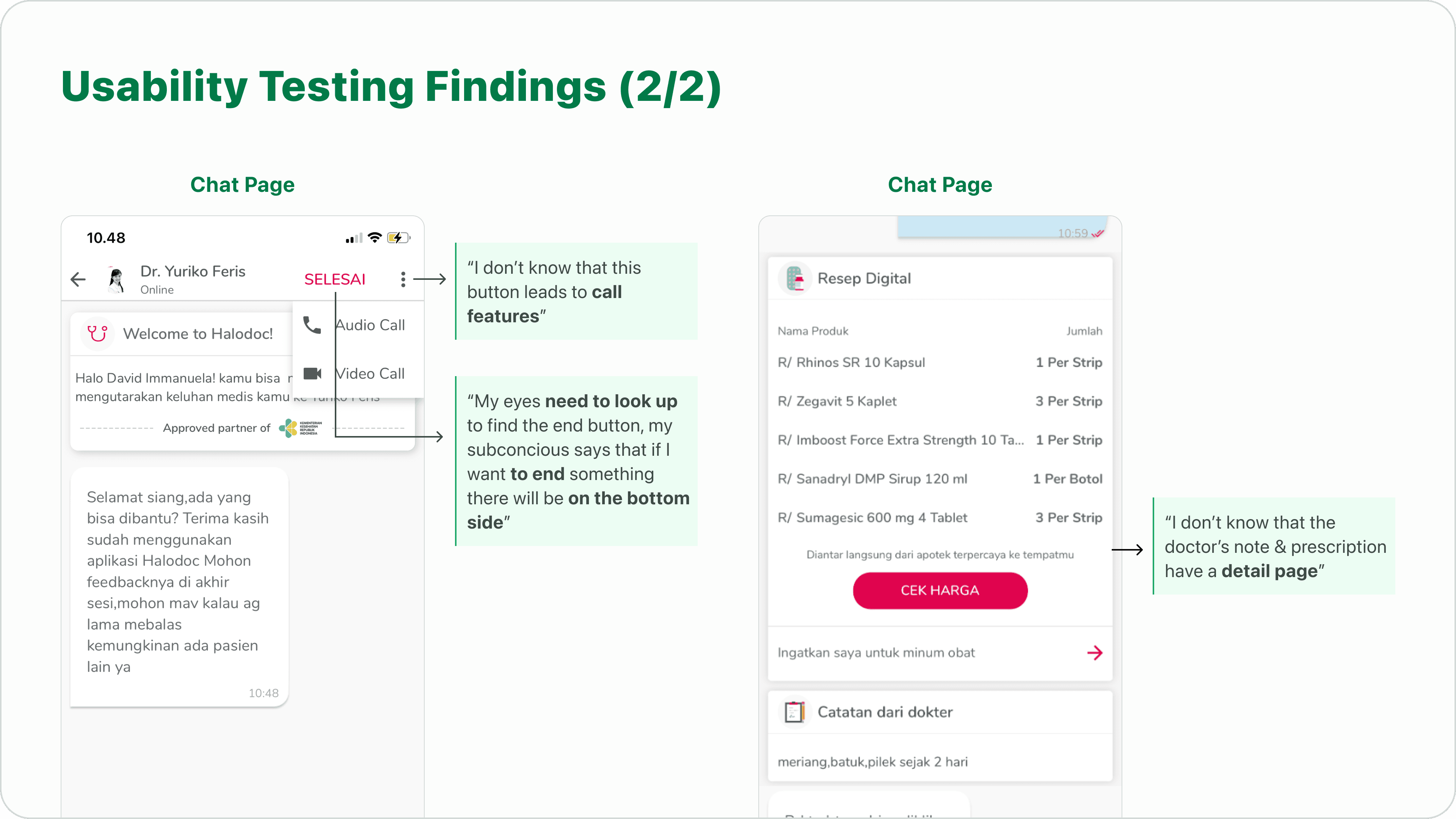
UT 1 Findings on the Chat Page
Affinity mapping
I used affinity mapping to group similar data points and identify areas for improvement.
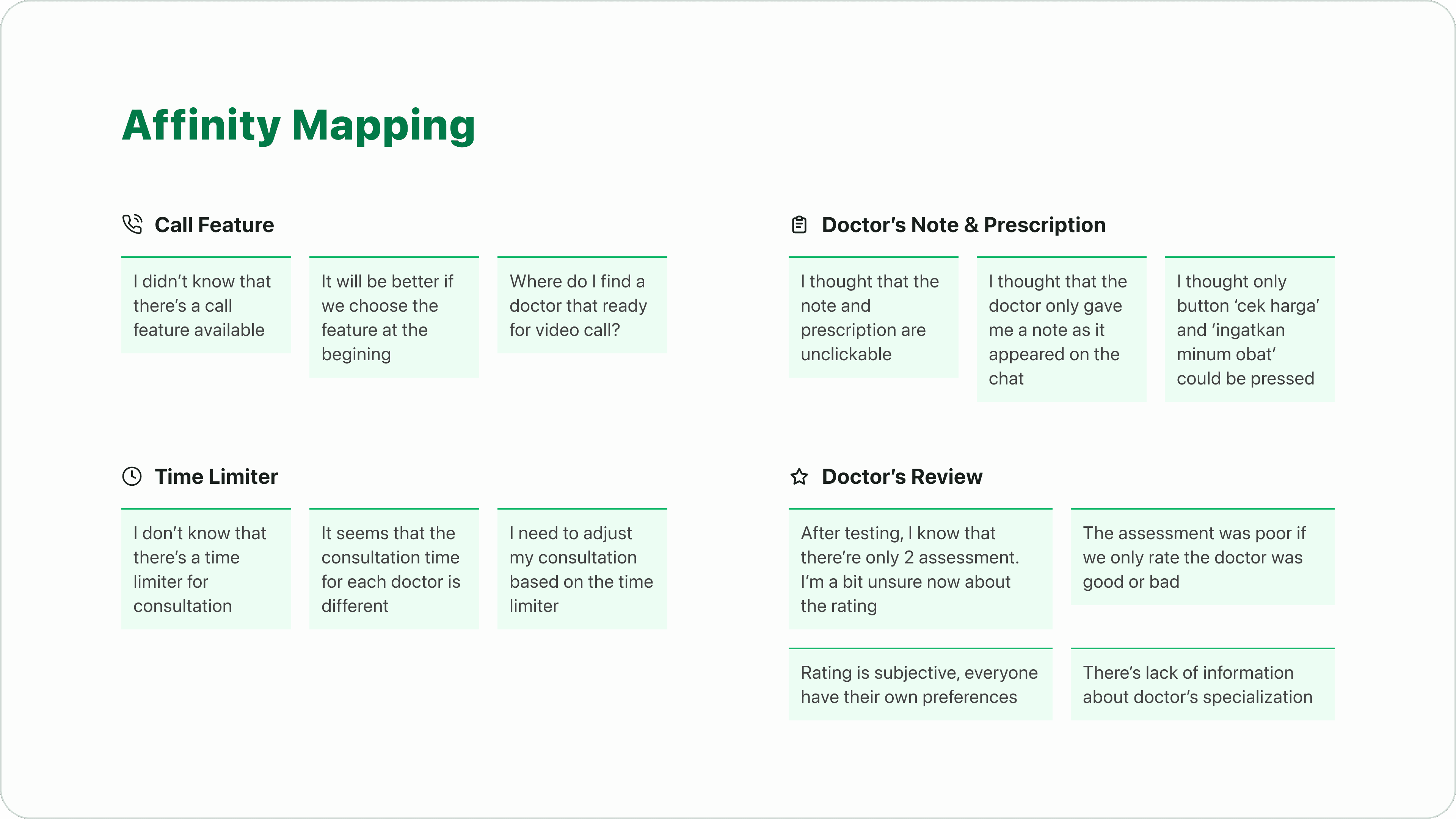
Affinity Mapping
Problem statement
By analyzing the four key themes identified through affinity mapping, I was able to pinpoint the underlying user problems. To address these problems, I employed the 'How Might We' question-framing technique to generate potential solutions.
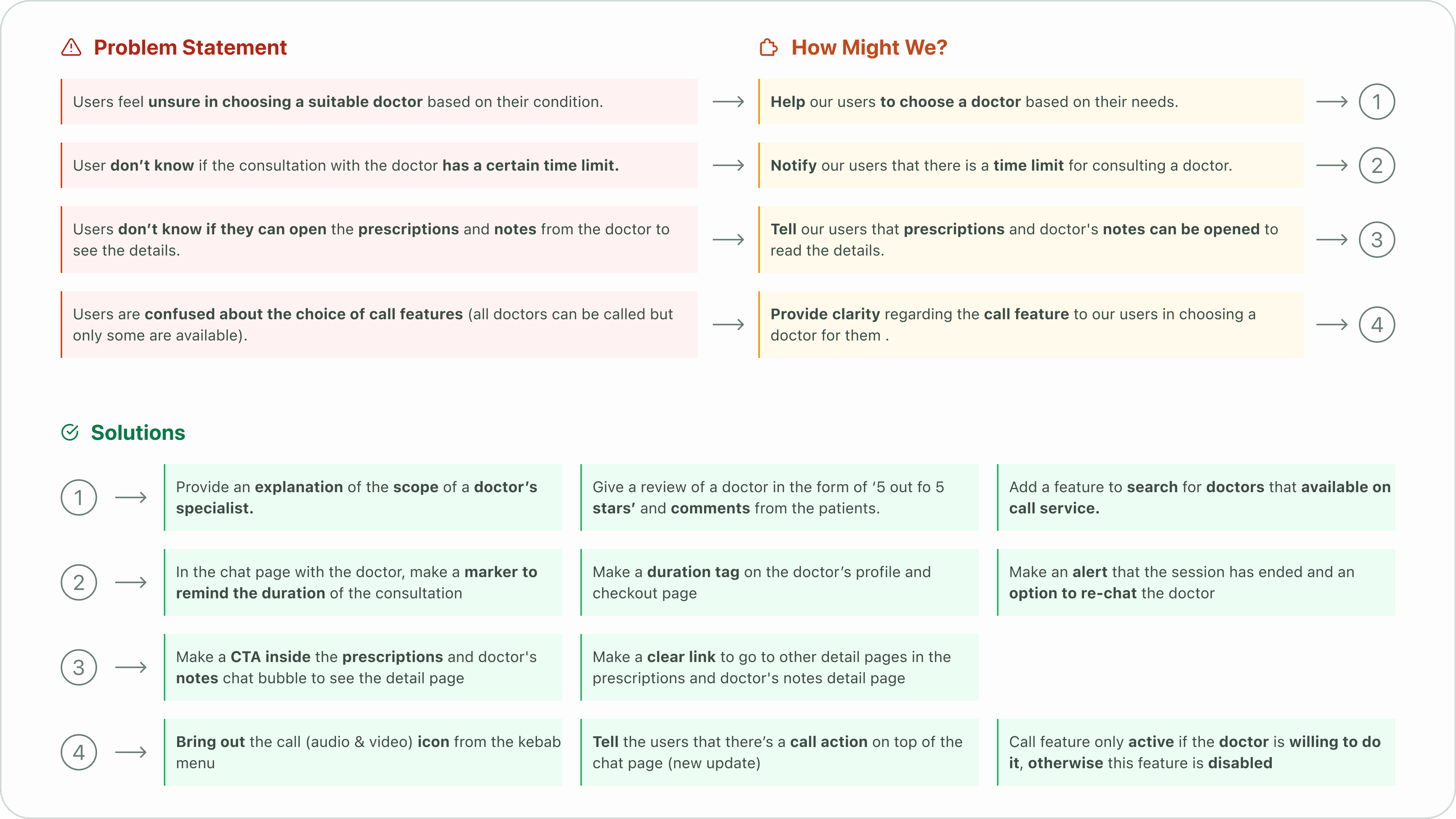
Problem, HMW, and Solution
Prioritization matrix
To effectively prioritize the numerous solution ideas, I created a prioritization matrix. This matrix served as a roadmap for implementation and a metric to assess the feasibility of each solution.
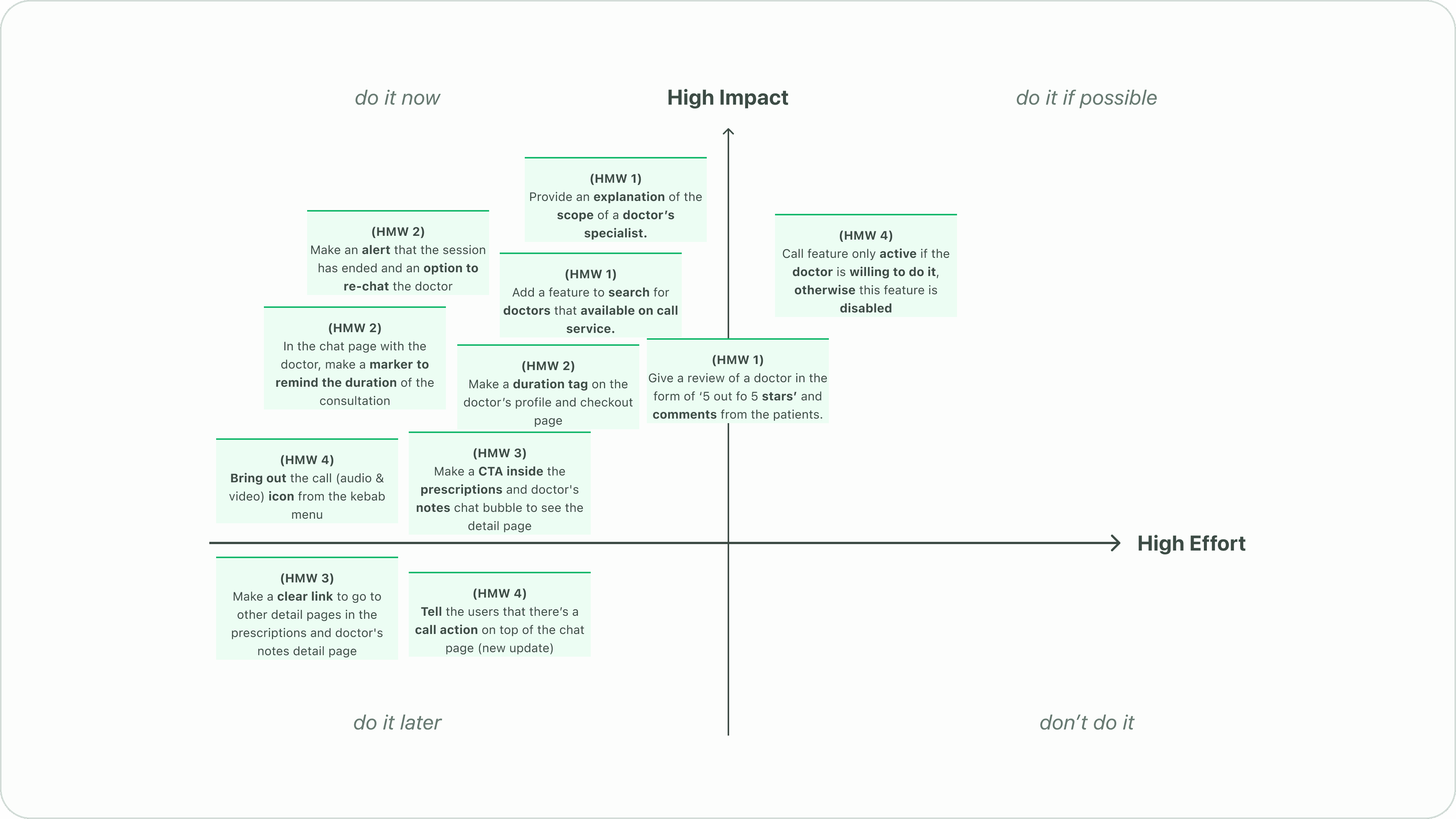
Prioritization Matrix
Competitive analysis
I conducted a competitive analysis to identify Halodoc's competitors and their strengths and weaknesses, as well as general telemedicine user journeys.
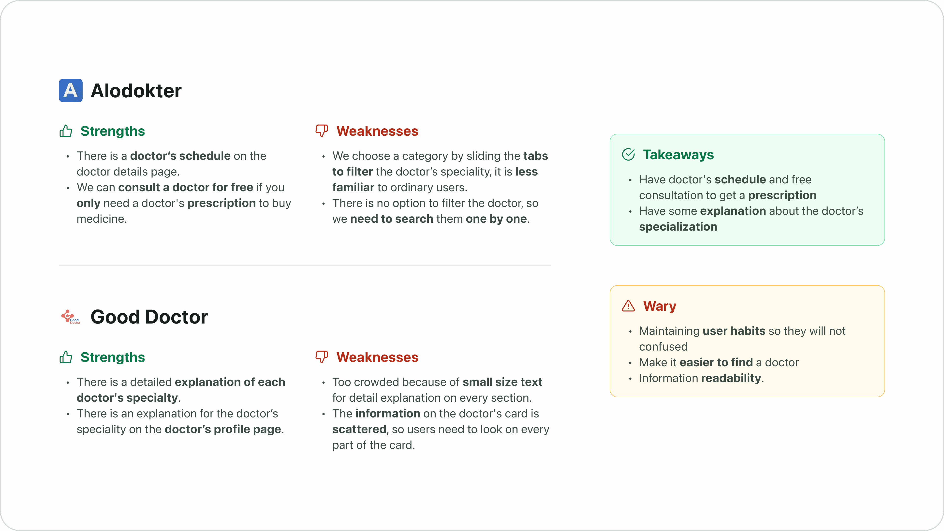
Competitive Analysis
Crafting the solutions
User flow
To visualize the user journey, I created a user flow diagram that outlines the steps a user takes from initiating a consultation to completing the process on Halodoc.
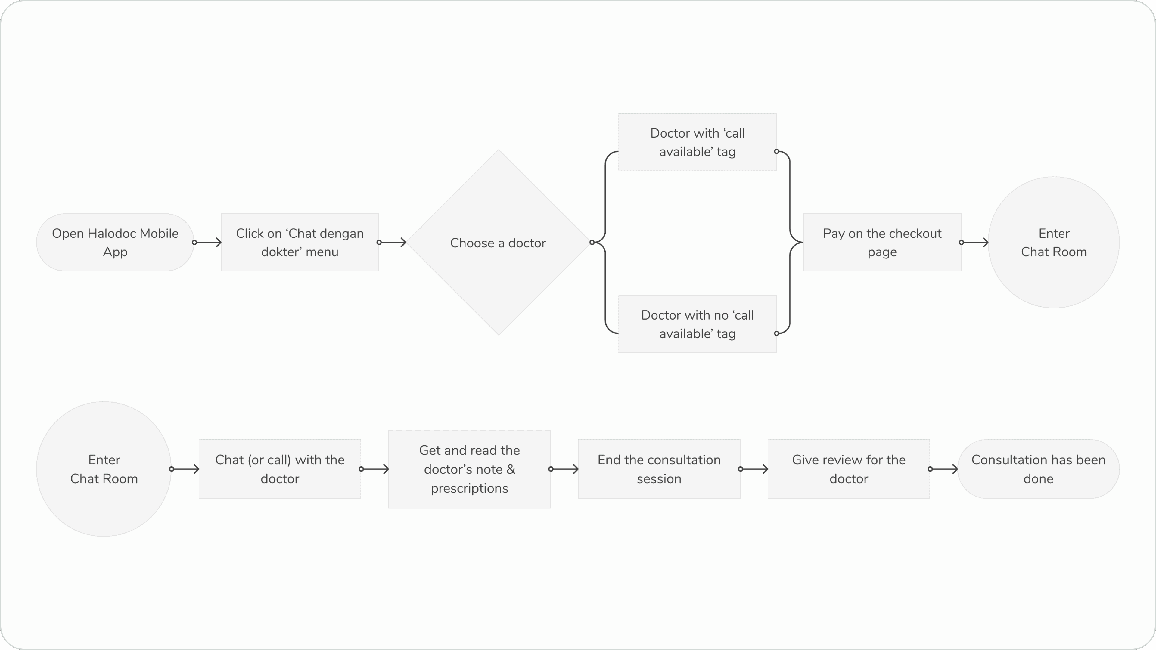
User Flow
Wireframe
Once I had a clear understanding of the user flow, I created a wireframe to outline the basic structure and layout of the redesigned interface.
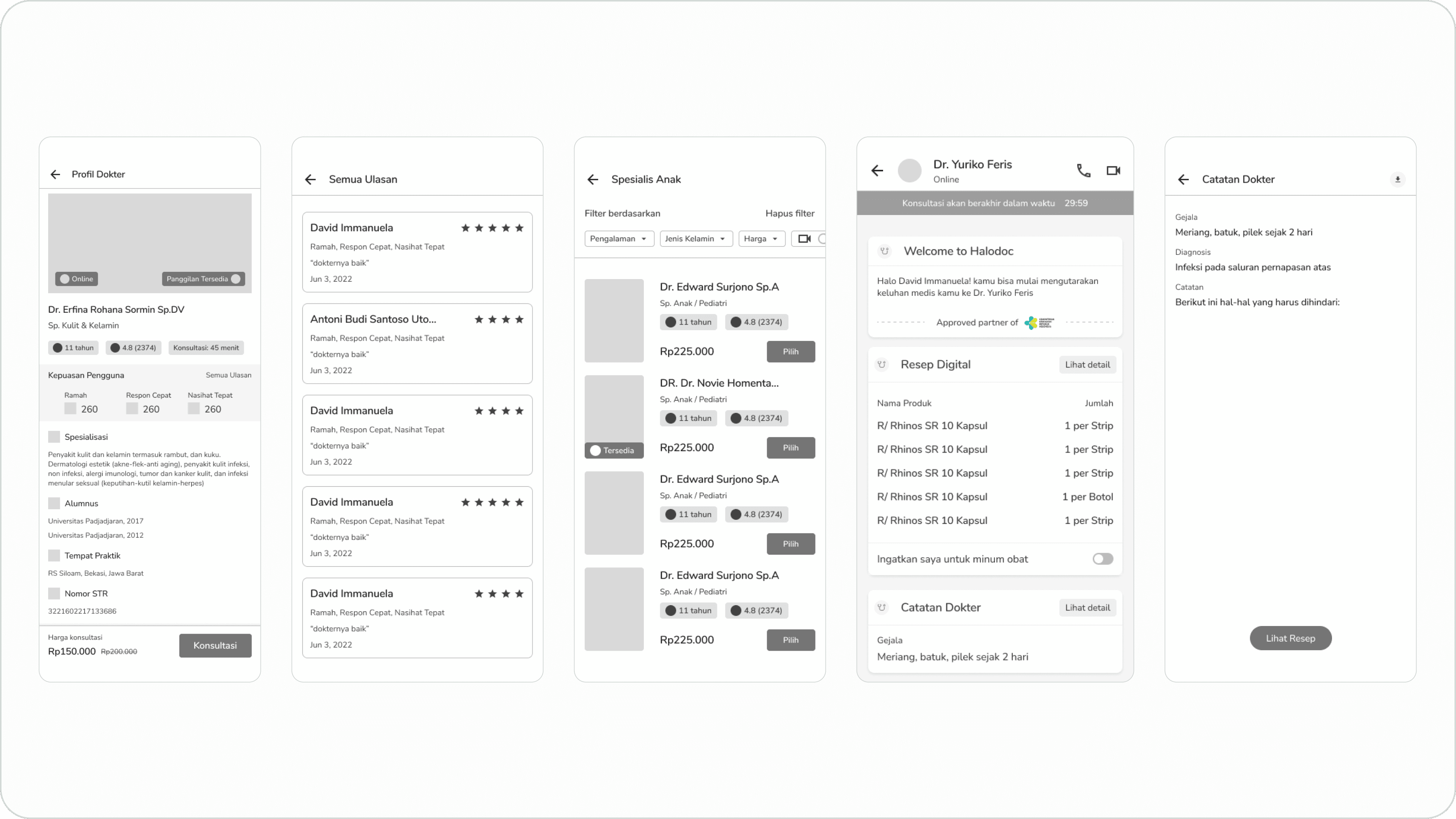
Wireframe Sample
Design system
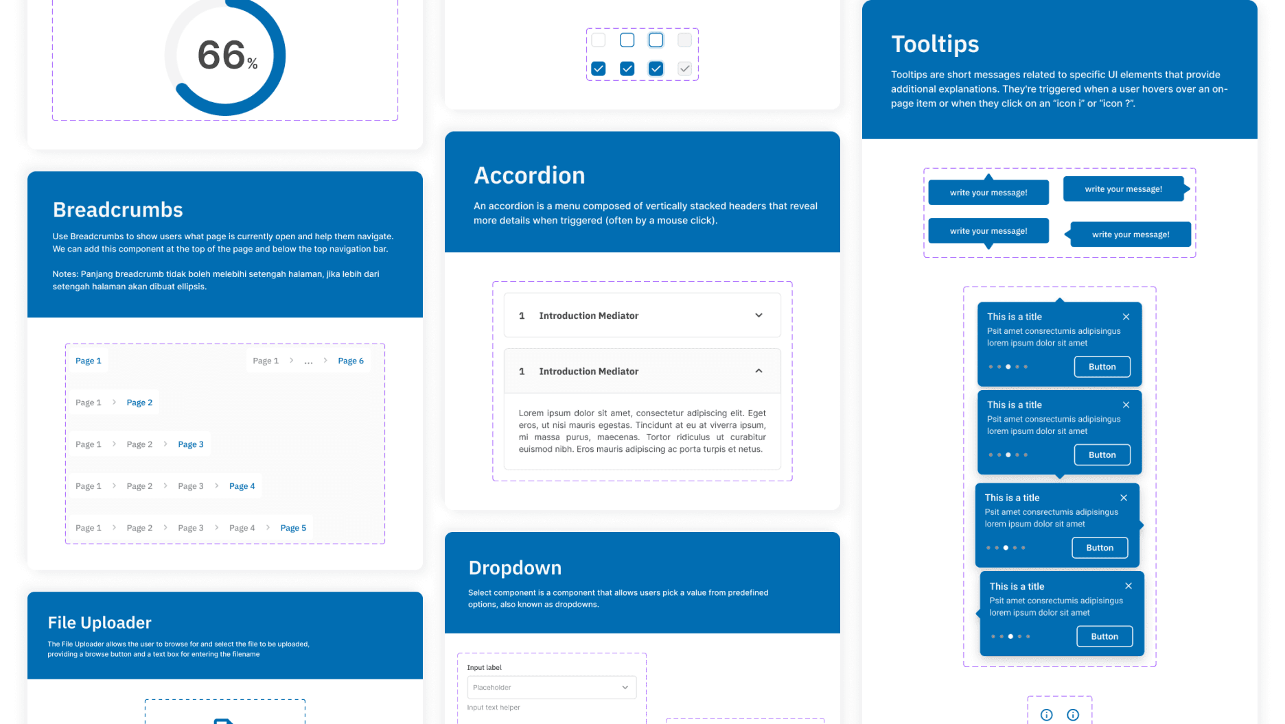
This design system aims to streamline the design process by providing reusable components.
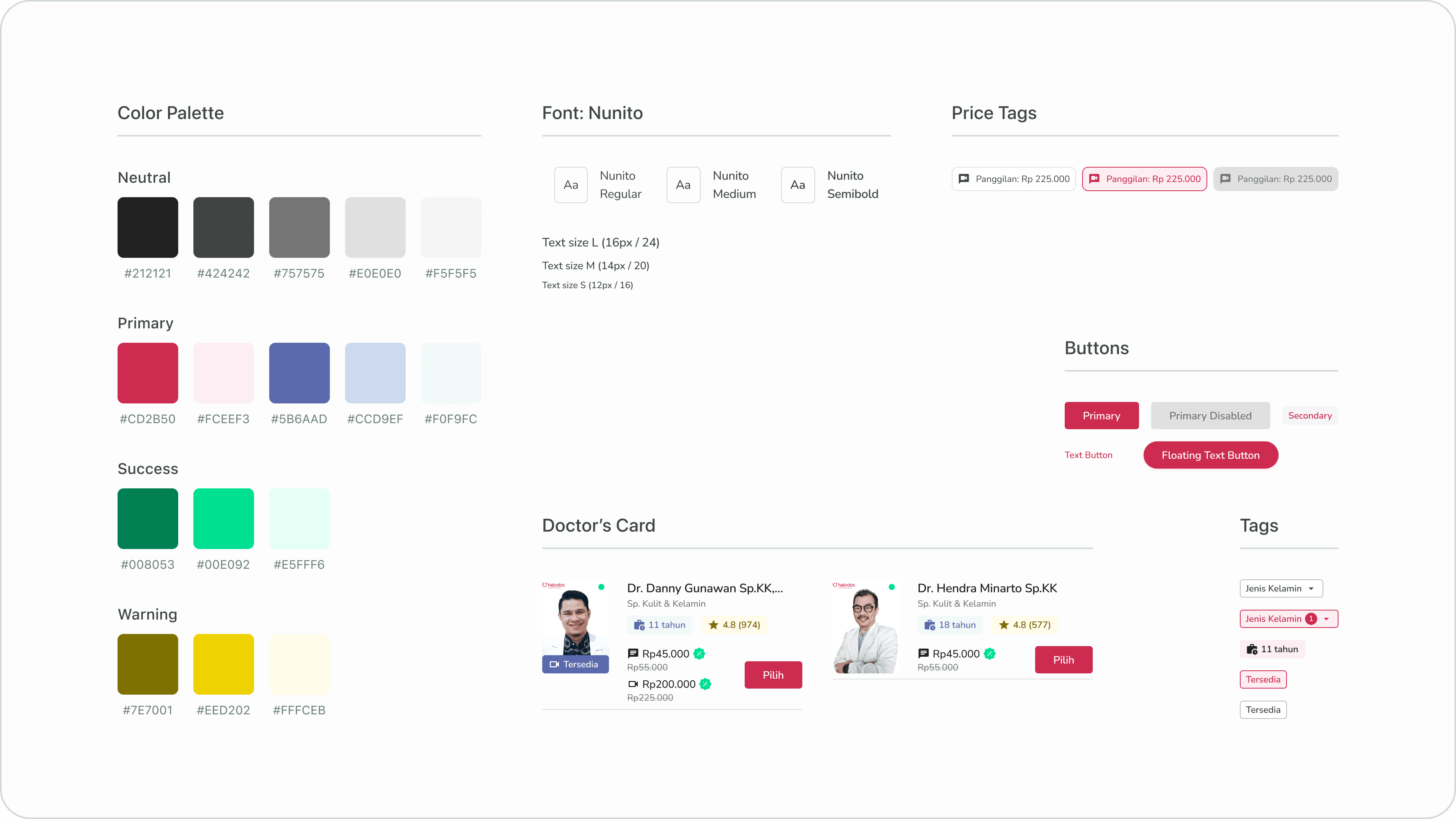
Style Guide and Master Components Sample
High Fidelity Design
Doctor Speciality Page
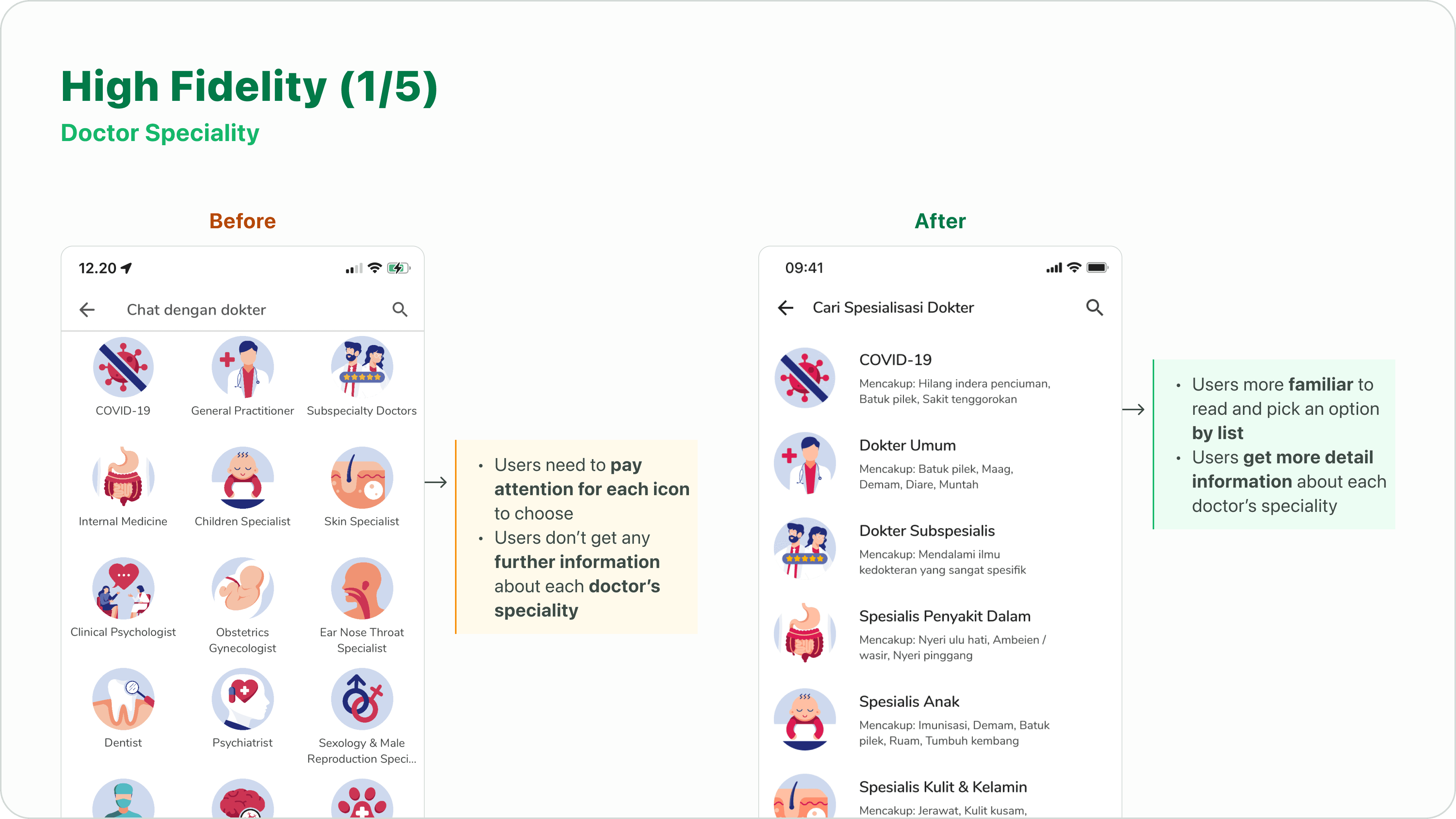
HiFi 1 - Doctor Speciality Page
I responded by explaining that the design of the specialist list was inspired by Good Doctor. I highlighted how Good Doctor effectively categorizes specialists based on their expertise, making it easier for users to find the right doctor.
Doctor List Page
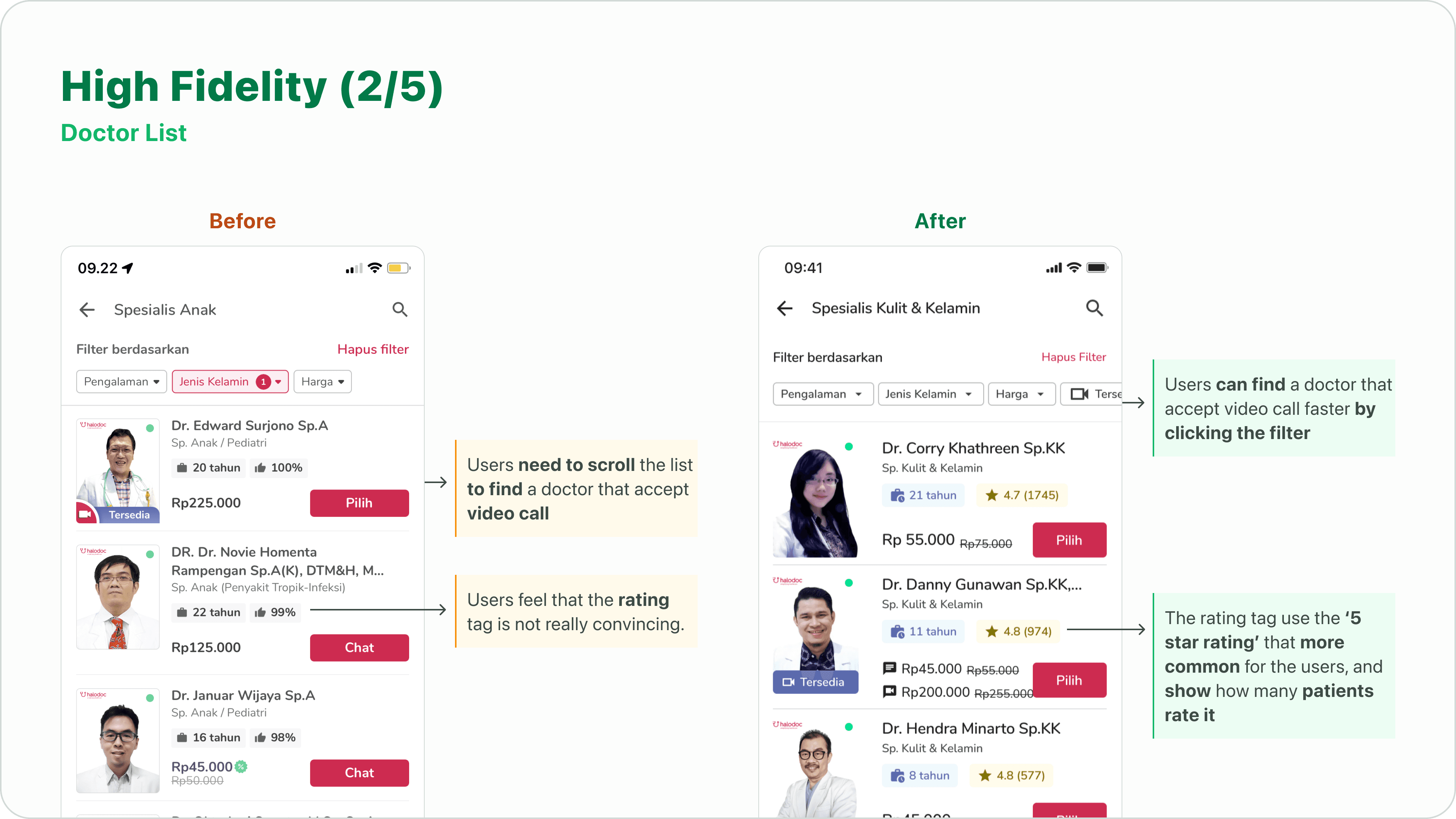
HiFi 2 - Doctor List Page
To improve the user experience, I incorporated a filter chip that allows users to search for doctors who offer video call consultations. Additionally, I introduced a 5-star rating system to encourage user engagement and provide valuable feedback on doctor performance.
Doctor’s Profile Page
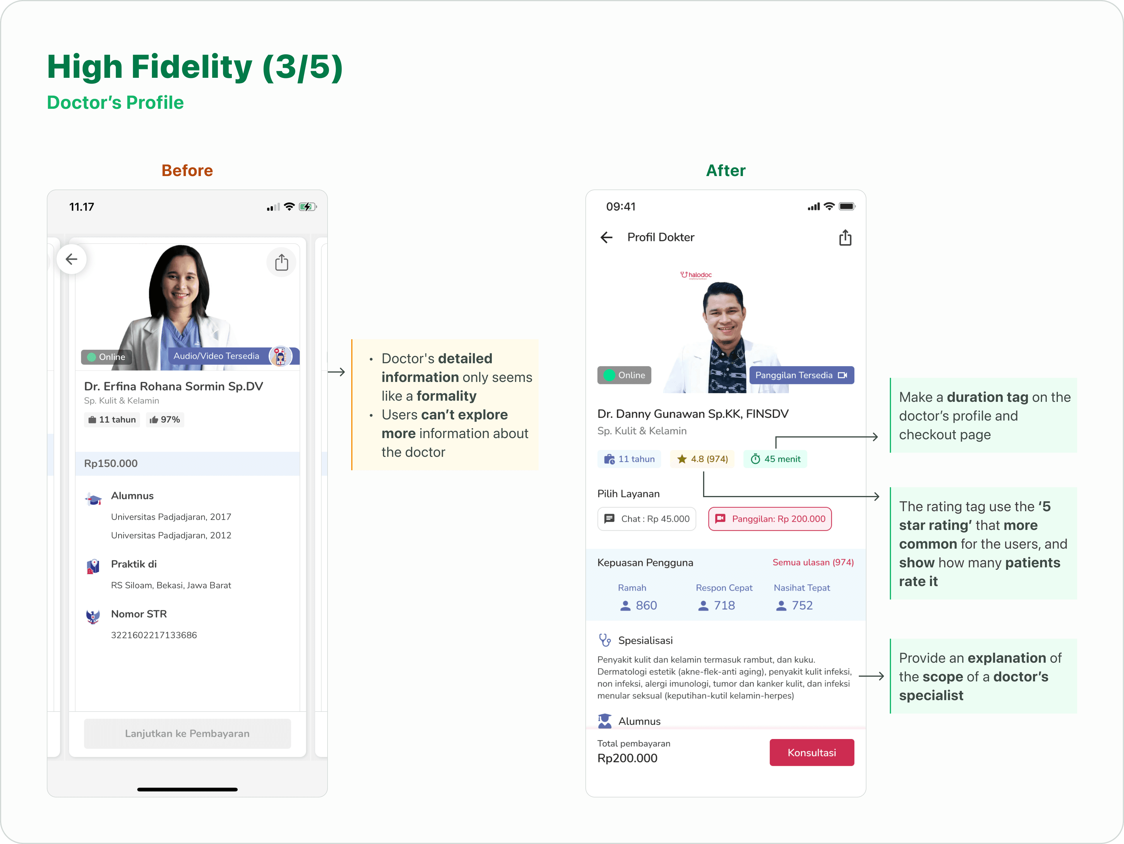
HiFi 3 - Doctor’s Profile Page
Chat Page
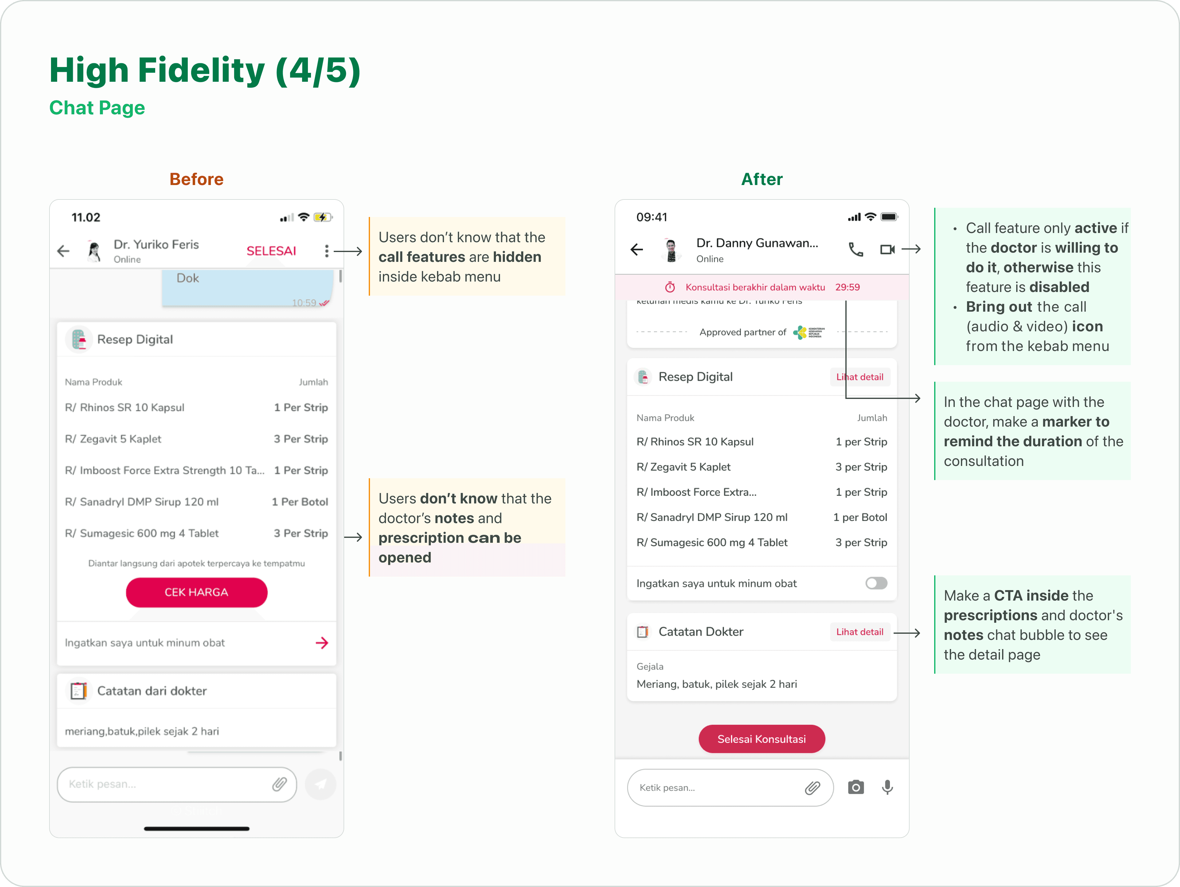
HiFi 4 - Chat Page
Review Doctor Overlay
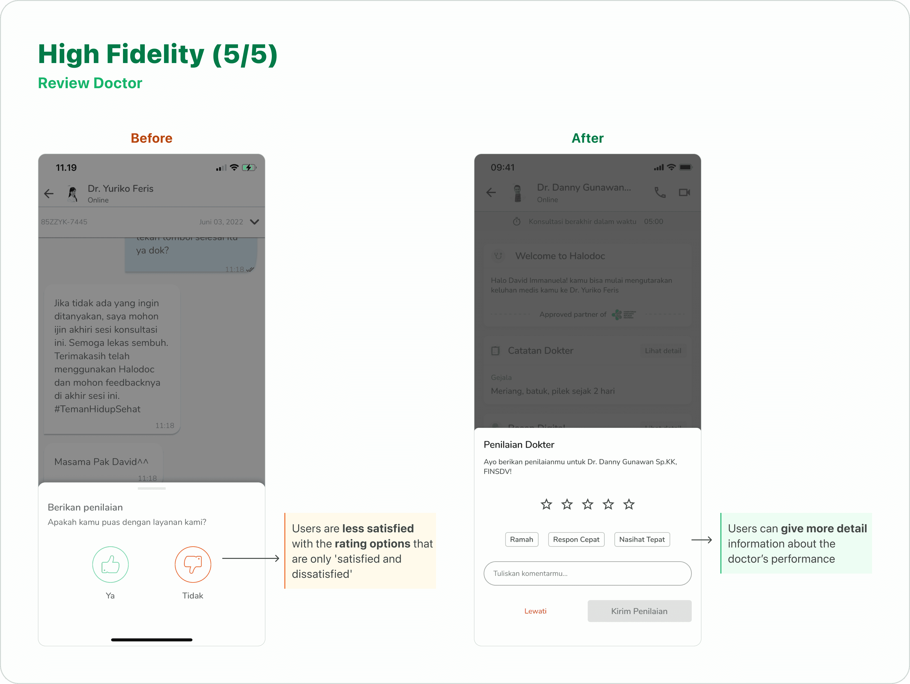
HiFi 5 - Review Doctor Overlay
Testing my redesign to the user (UT 2)
To evaluate the effectiveness of the high-fidelity design, I conducted a usability test with the same five participants who had participated in the initial round of testing.
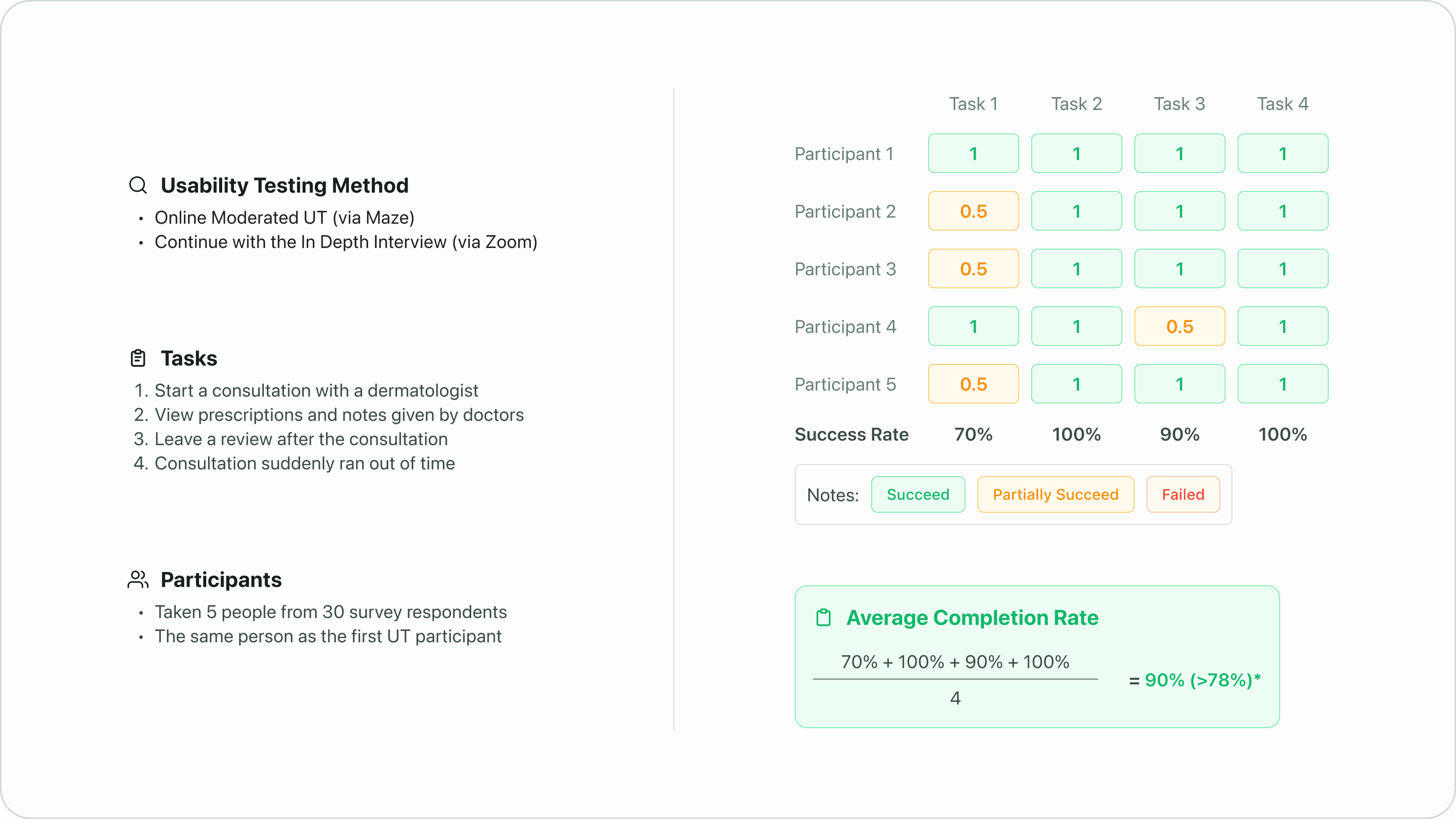
Usability Testing Results
With an average completion rate of 90%, significantly higher than the industry standard of 78%, the design demonstrated high levels of user comprehension and ease of use.
*Usability Metrics of Effectiveness: According to a study carried out by Jeff Sauro, the average Task Completion Rate is 78% (based on an analysis of 1,100 tasks). Source
Iterating my design based on the user input
To ensure continuous improvement, I conducted follow-up interviews with participants to gather feedback on the design prototypes. Their insights were invaluable in refining the designs through iterative processes.
Doctor Speciality Page
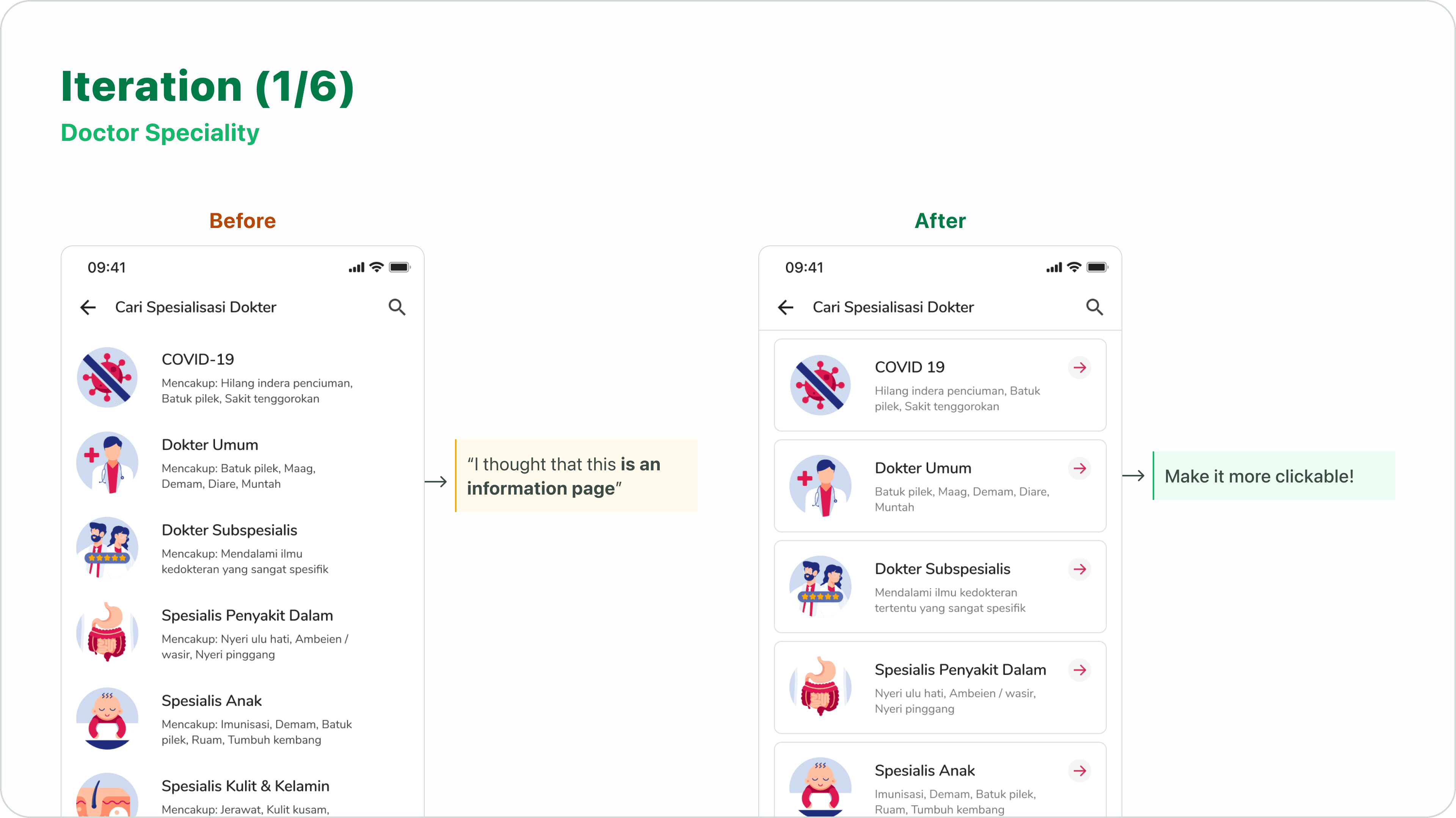
Iteration 1 - Doctor Speciality Page
Doctor List Page
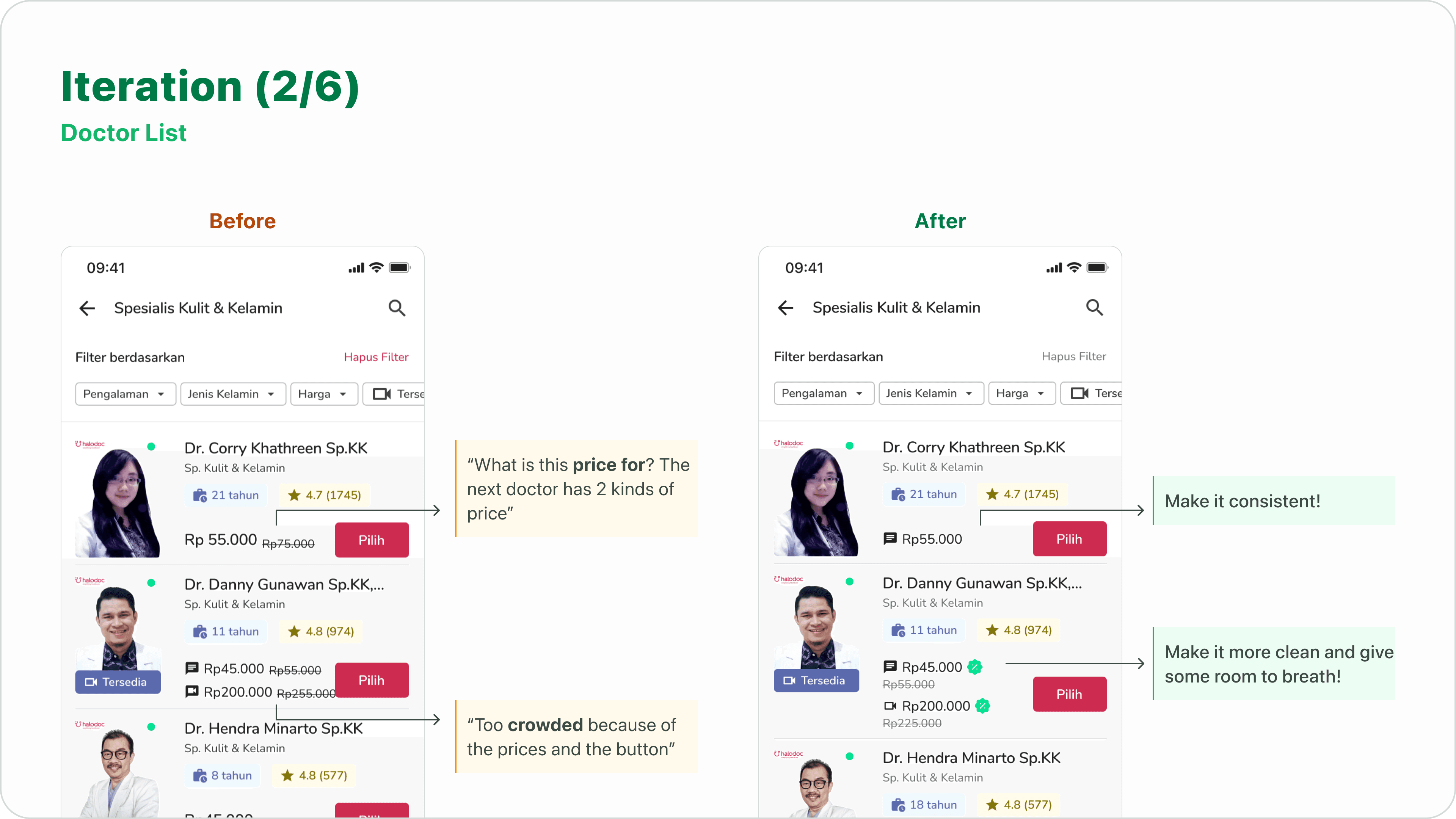
Iteration 2 - Doctor List Page
I standardized pricing formats and increased white space in the doctor card design for better readability.
Doctor’s All Review
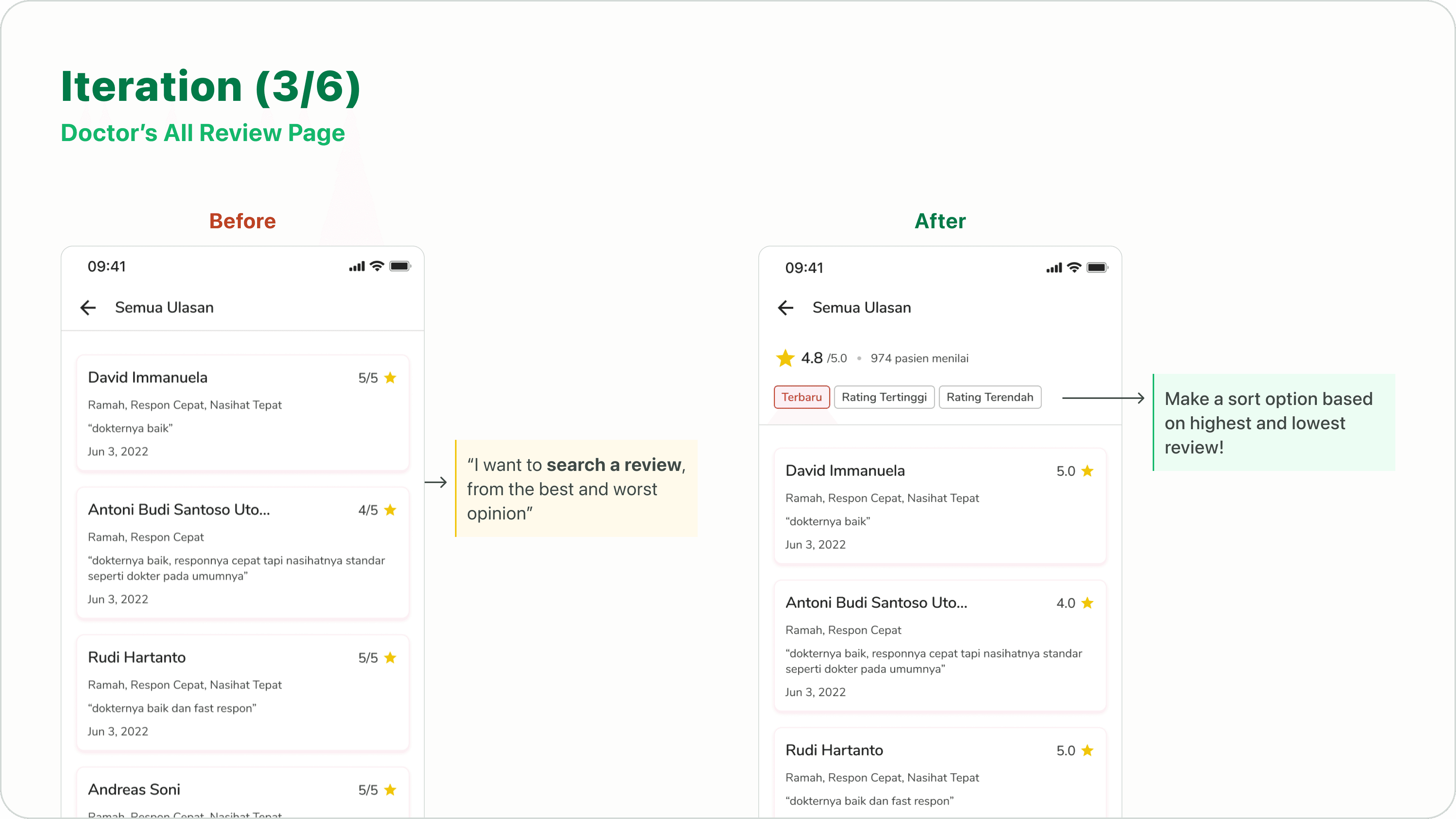
Iteration 3 - Doctor’s All Review Page
Time Limit Reminder
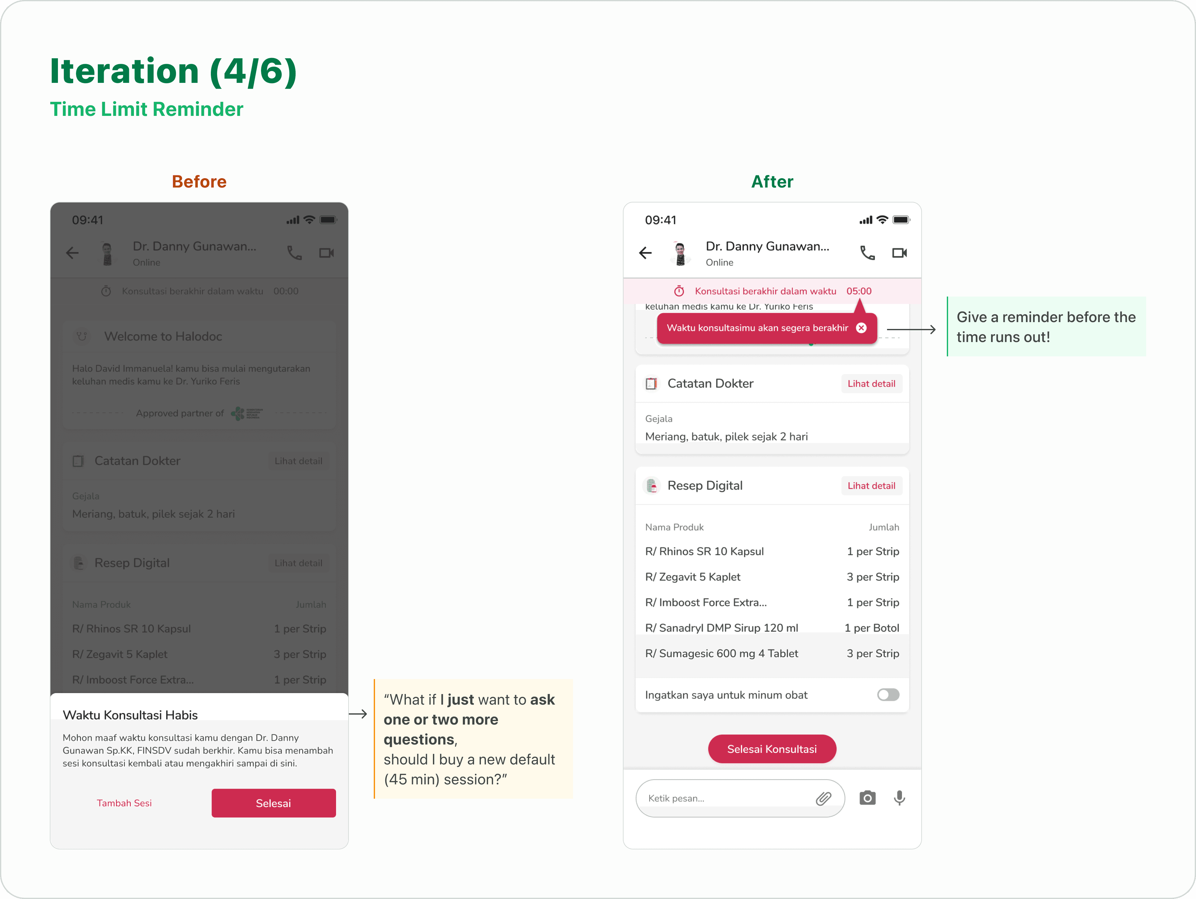
Iteration 4 - Time Limit Reminder
Chat Page
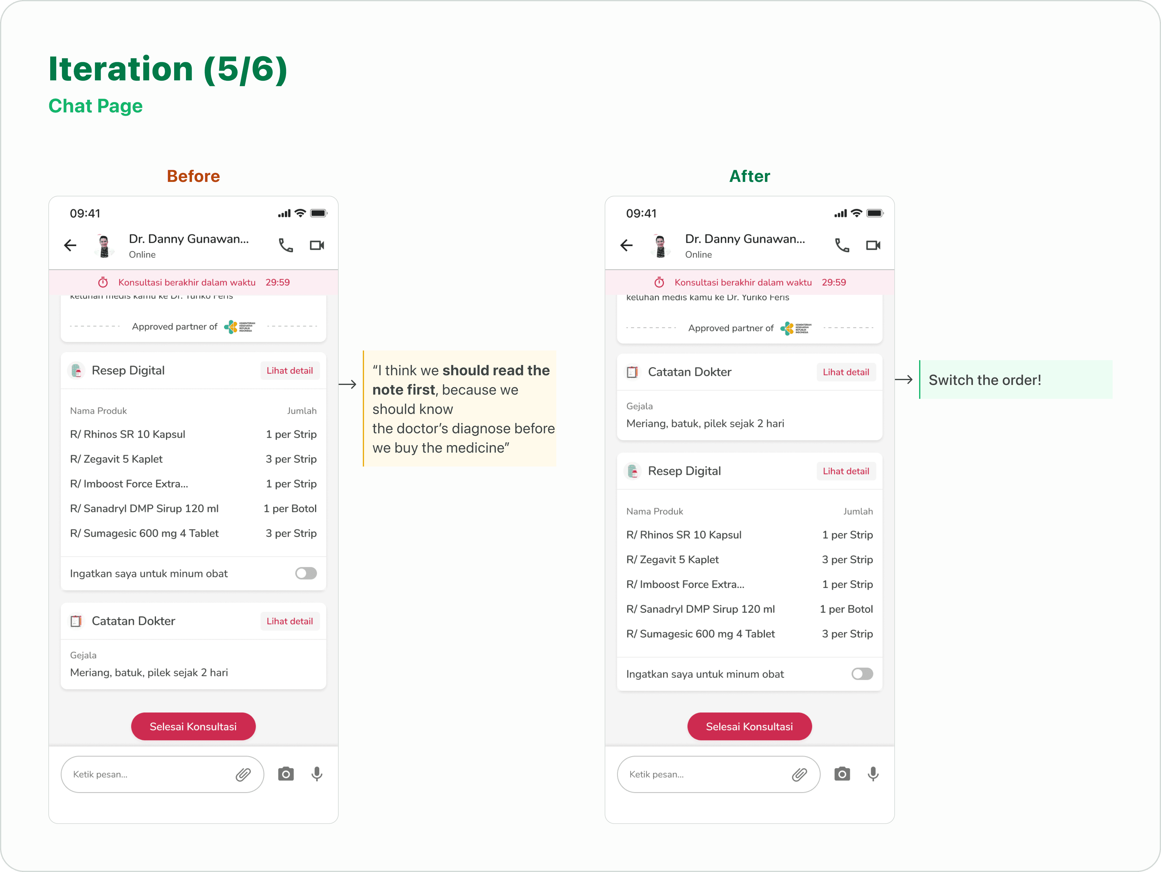
Iteration 5 - Chat Page
Doctor’s Note

Iteration 6 - Doctor’s Note Detail Page
Reflection
The Halodoc case study was the most extensive project I've undertaken since joining Purwadhika's bootcamp. I also identified areas for improvement and gained valuable insights for future projects.
I found that using auto layout significantly improved the efficiency of making design changes, as it automatically adjusted the layout to accommodate content updates.
I learned to utilize master components to accelerate my workflow.
To maximize efficiency, I need to create a clear and detailed plan outlining the research and design process.
© 2024 by David Immanuela